Fintech Firm
Project Highlights
Establishing a distinct local identity for this Oakland outpost, two selected furnishings with a warm palette of natural colors and materials that reflect the East Bay landscape.
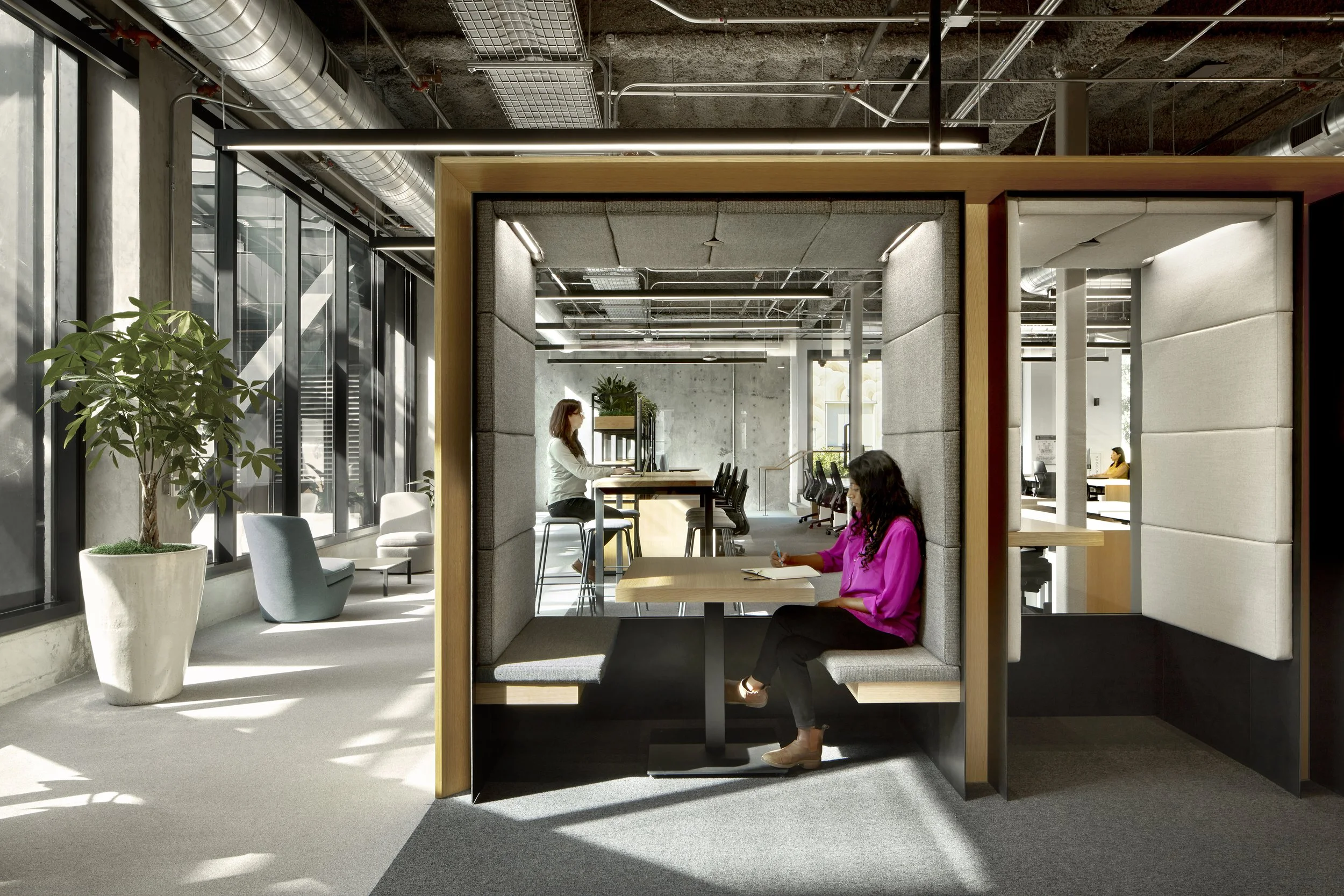
Supporting our design partner’s vision to transform corridor spaces into alternative workspaces, we sourced tables, stools, chairs, and sofas that accommodate diverse workstyles and optimize space.
We married aesthetics and functionality with key custom pieces, including a tech-savvy conference table developed specifically for this project and a handcrafted table made by a local artist.
Bringing cohesion *and* variety to an East-Bay-inspired workspace
When a San Francisco-based fintech firm made plans to open a new Oakland outpost, two was brought onboard to support their vision for a distinct East Bay outpost. Like the firm’s San Francisco headquarters, this Oakland office needed a wide range of spaces to satisfy their teams’ different working styles. We designed flexible utility into every space, including corridor spaces that we outfitted as lounges, coffee spots, and other alternative work areas.
Across the project, our furniture selections, indoors and outdoors, took cues from the East Bay landscape and the rich, natural tones of the building’s architectural elements. A consistent palette of wood tones, greens, blues, and browns infuses the entire project with natural warmth, making this Oakland-specific space feel like home.
The building’s core boasts an impressive multi-level atrium that brings natural light into interior spaces, while ample outdoor spaces include views of the Fox Theater, restaurants, and neighborhood bars, as well as the San Francisco hills and Bay.
Central to the project’s vision, BCJ Architects designed the building’s common spaces and circulation areas—both indoor and outdoor—to double as flexible workspaces. To support this vision, we selected a wide range of seating and tables so employees could work and meet outside of traditional desking areas. On higher levels of the building, we furnished patio spaces with outdoor furniture that brings workers into relation with the natural landscaping and views of the environment.
Magic trick: in-between spaces go center stage
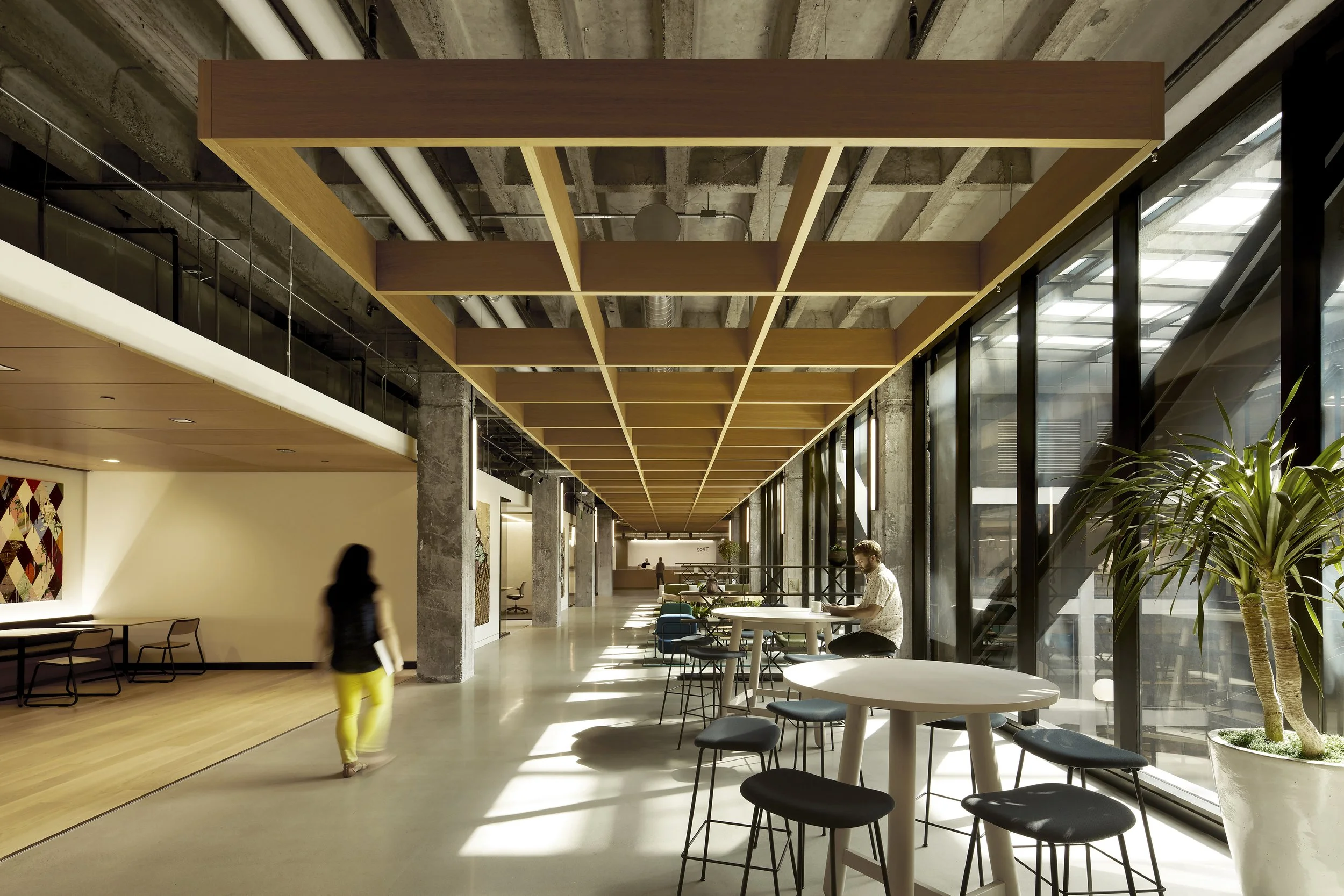
This project called for two to perform some design magic: our furniture selection helped transform hallways into spaces built for lingering. The transitional space above is also used as a small café—a place to fuel up or chill out. Tucked snugly under a dropped ceiling, the cheerful coffee shop space radiates a bright, subtly animated vibe with furnishings selected to echo the building’s mix of materials.
White table tops rhyme with the flooring and columns. To pair with two-top tables in the back of the space, we chose Naughtone Bounce chairs for their stripped-down construction of plywood and steel, which picks up the room’s warm wood tones and the building’s exposed girders. Finally, we sourced low-backed bar stools from U. S. manufacturer HAY for the built-in coffee counter.
To offer user-friendly variety, we gathered similar, but subtly different seating options for the hallway adjacent to the cafe. To pair with high-top tables by Dutch furniture maker DUM, we chose backless bar stools by Muuto. These moments of variation and resonance lock in this space as a cohesive yet lively setting—a concentrated dose of café culture that also works for the office.
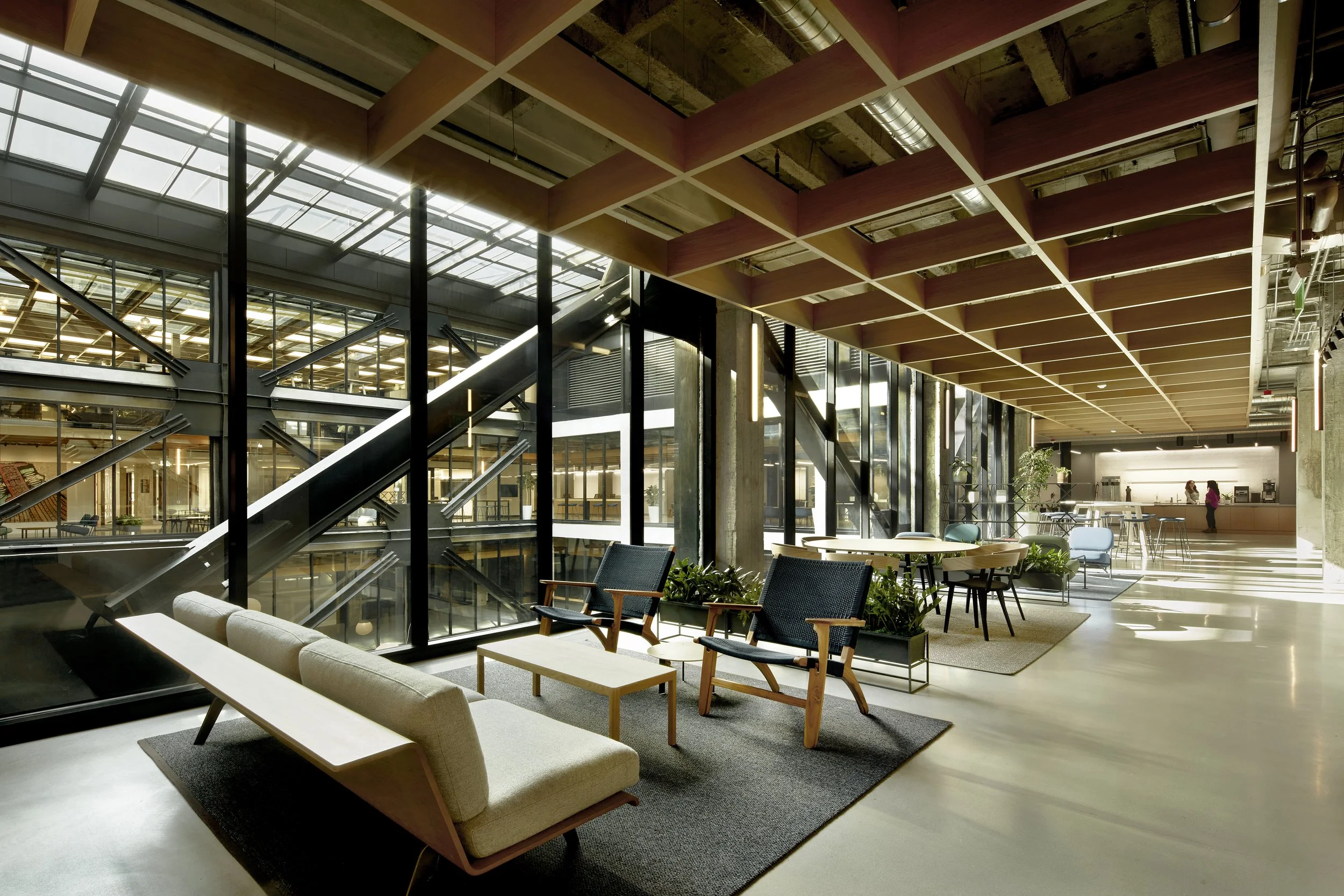
On each level, we made sure to create undefined, mutable spaces—neither café spaces nor workspaces—to incite thinking outside the box. The fact is, some get their best ideas sitting on a couch, while others need a table-top surface—and a cup of coffee.
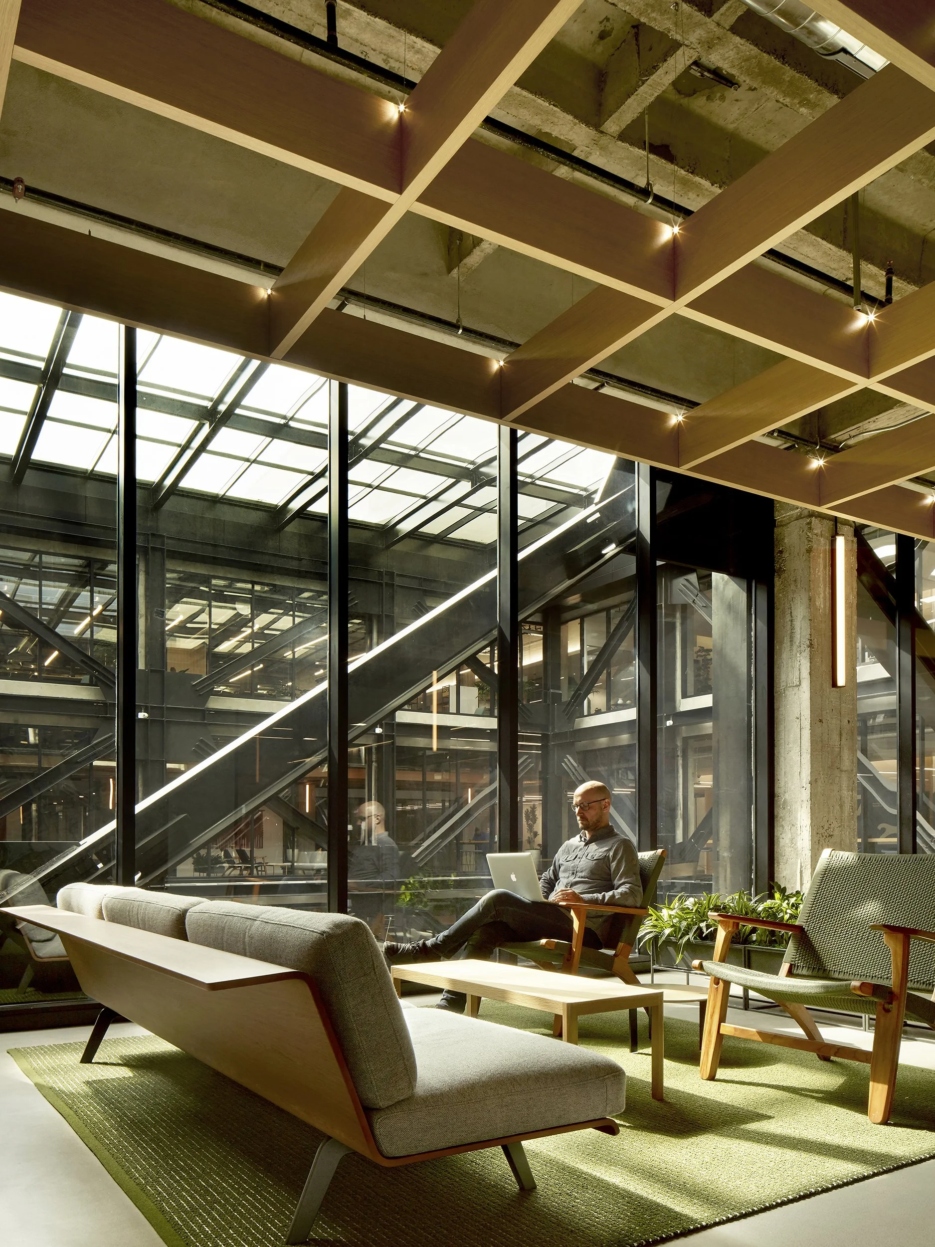
We specified super flexible pieces, like the tall tables and stools adjacent to the café area, as well as living-room-style pieces, which include comfy textile-and-wood armchairs by Masaya, custom area rugs by Kasthall, and wood-backed sofas by Arper. To delineate select areas in the open layout, we placed shelving units by Swedish design shop HEM, selected in minimalist black to resonate with the building’s exposed black girders.
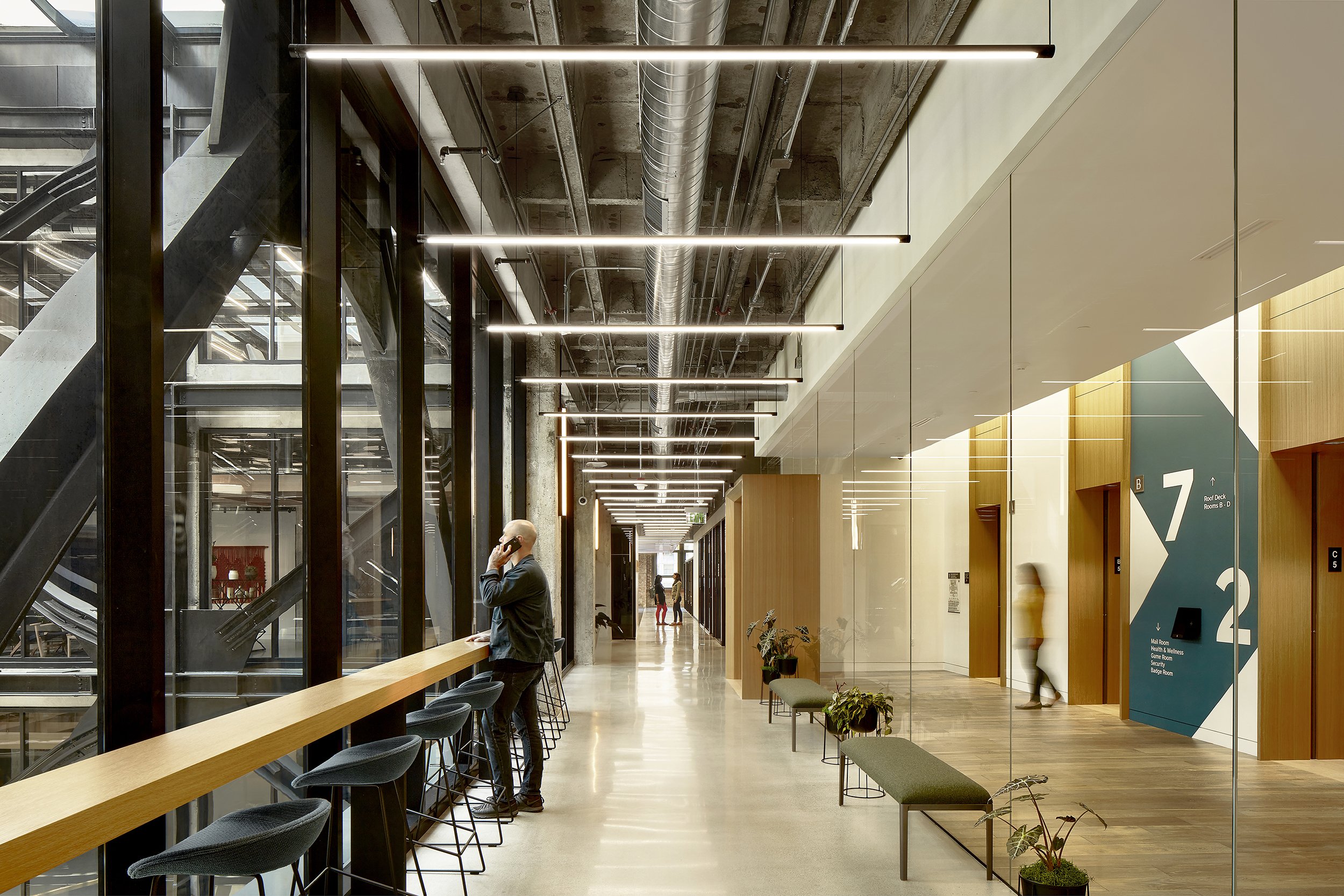
At your typical office, elevator doors open to hallways of static, empty space. Not here. For these elevator stops, we concocted a plan to optimize what is this slimmest portion of the atrium-hugging corridors. The key ingredients for this transformation: minimalist pieces that are big on style and lean in build. Our selections include upholstered benches from Italian furniture maker Bensen and bar stools by HAY, which tuck neatly under an ultra-narrow, built-in millwork counter. Now elevator doors slide apart to reveal a chic, streamlined lounge.
This elevator border area also reveals a sample of the project’s ongoing design strategy: repetition of elements to induce rhythmic continuity from space to space. HAY bar stools appear here and in café spaces. We also repeated upholstery selections as part of this pattern-making. These elements are selected to riff off repeating architectural features, such as polished concrete floors, exposed structure, and wood veneer. These visual rhymes and iterations weave together a welcoming familiarity across spaces—like breadcrumbs you follow through different regions of the office world, always finding yourself at home.
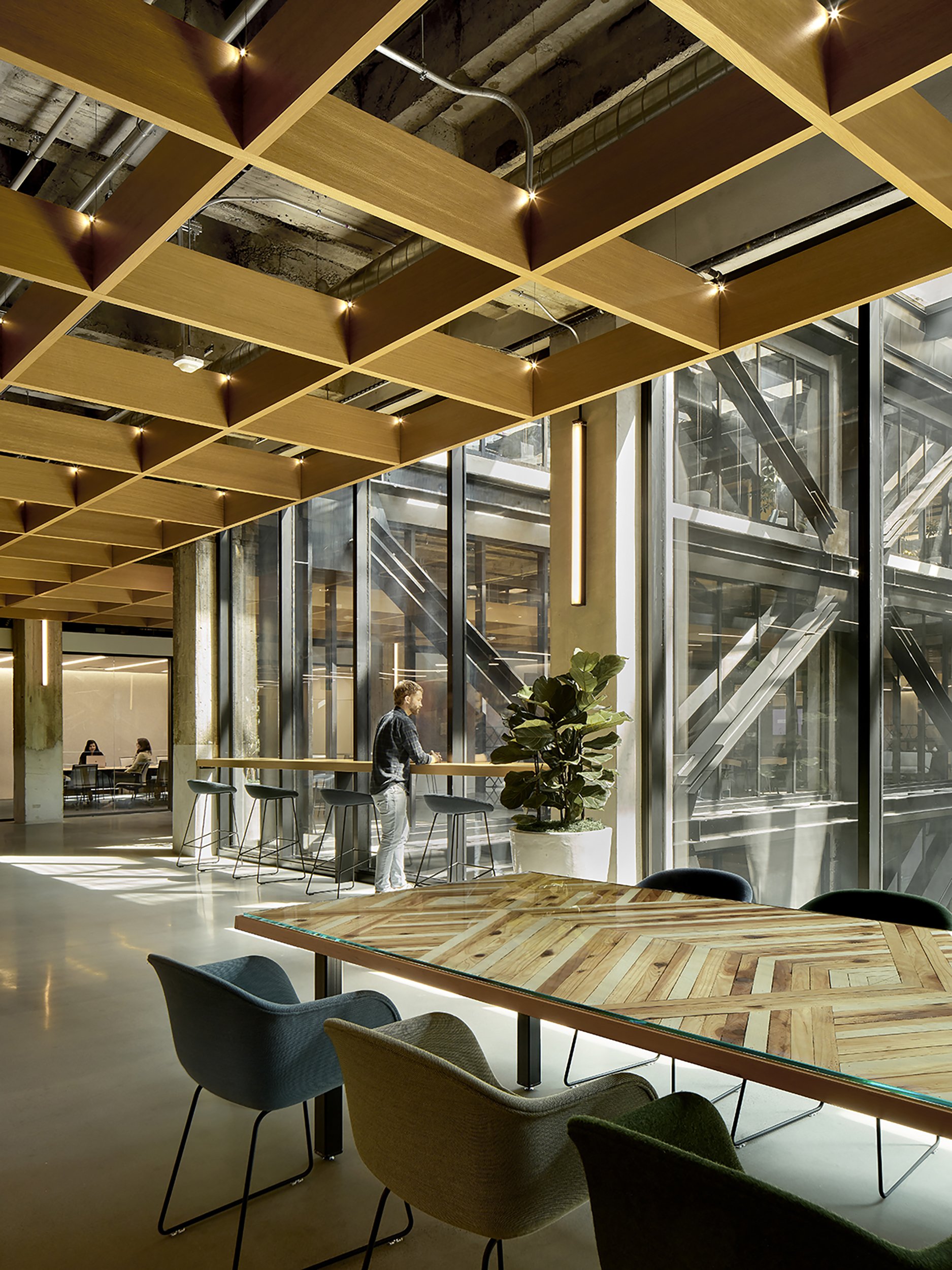
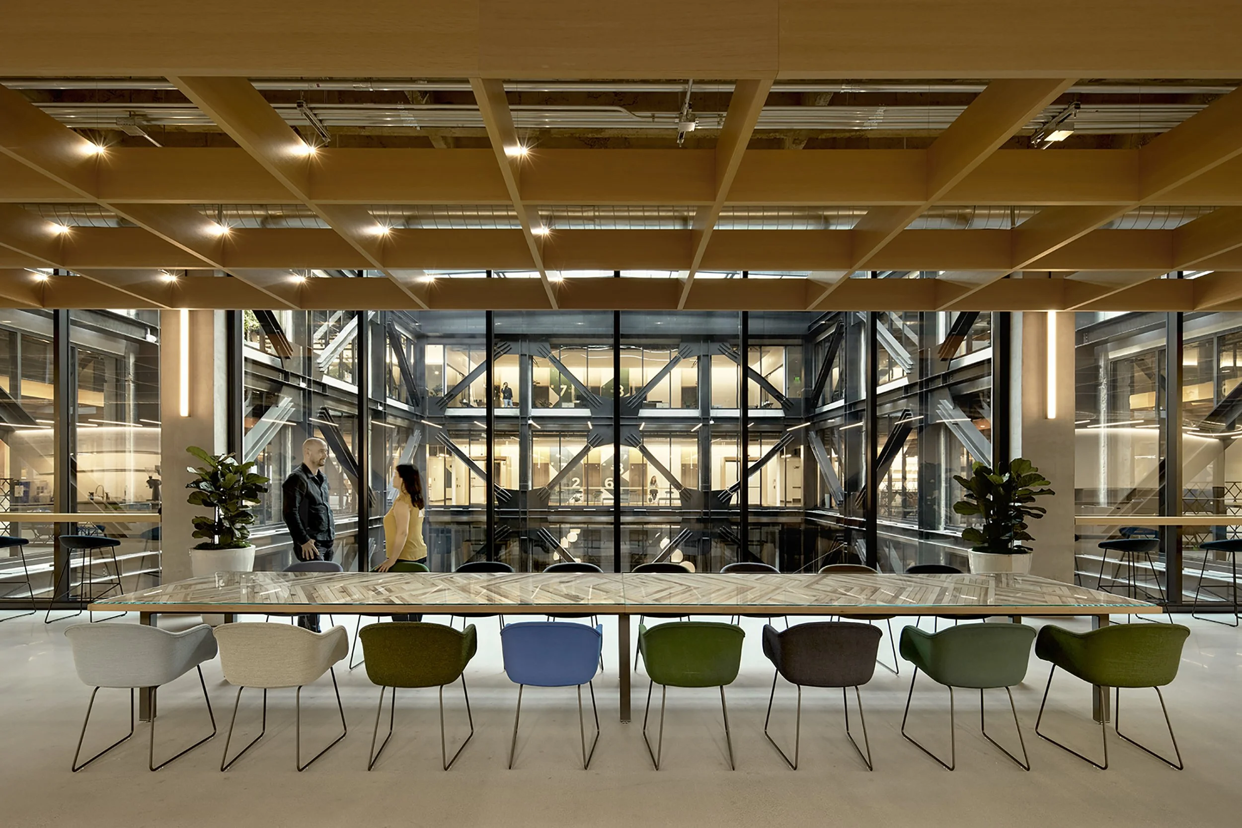
One of the most enchanting moments in this project is evoked by a table-cum-wood-mosaic by Oakland-based artist Aleksandra Zee. This unique art piece elevates a transitional area into the realm of design-forward spectacle. Following a tip-off from the project’s architect at BCJ, we tracked down the East Bay creative on Instagram and commissioned a site-specific piece. Known for combining found and re-purposed materials, she delivered this bit of sorcery: a tabletop that braids warm-toned timber slats—blond, brown, and white—into a spell-binding geometric pattern.
To showcase this stunner, we added a glass top for protection and assembled chairs to fan out on one side with sightlines aimed at the atrium. In tune with the multi-tonal table, the chairs by Muuto are upholstered in different but companionable shades that sync with the project’s overall color scheme.
Meeting at the intersection of tech and tradition
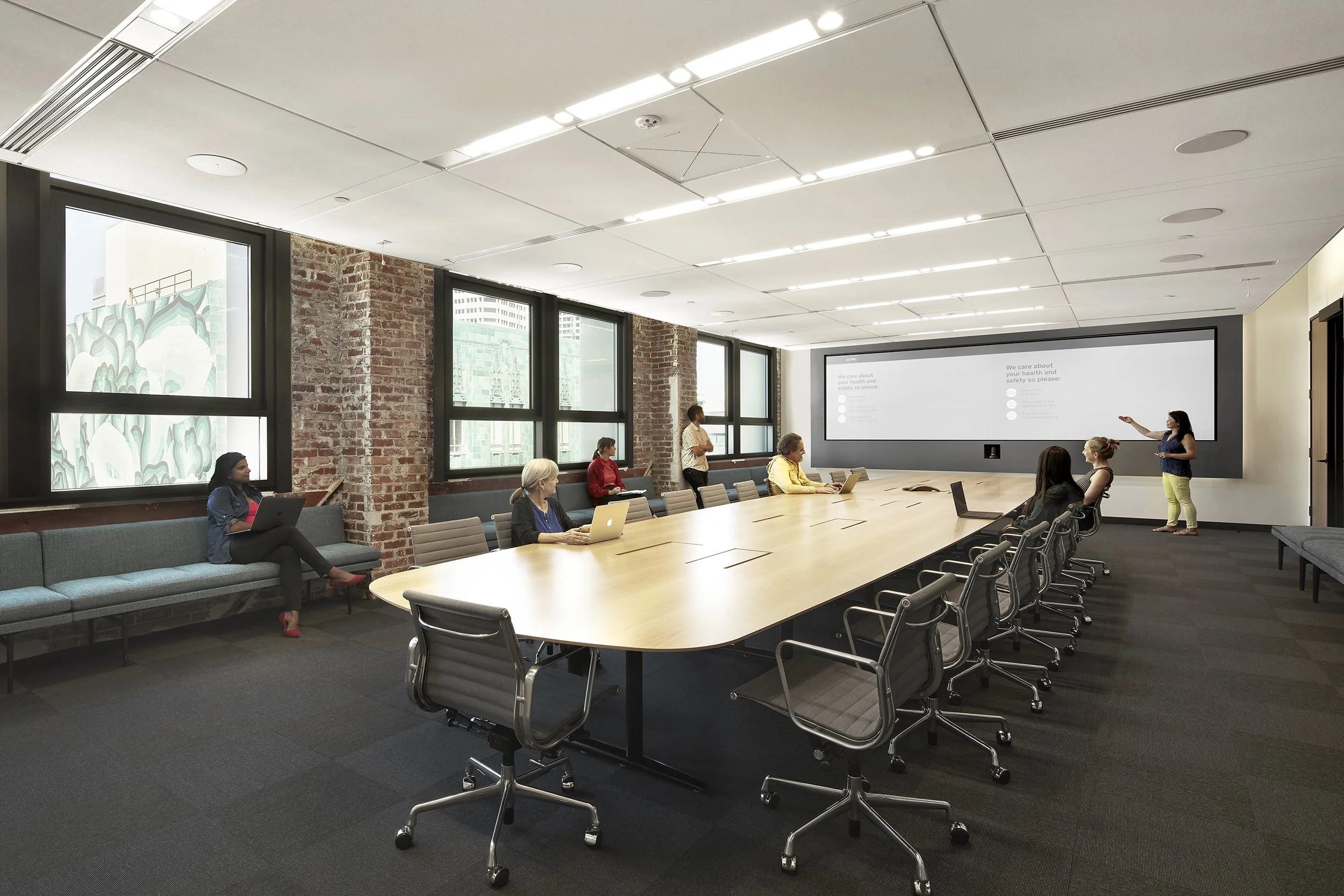
While a traditional conference room was essential to the firm’s large team meetings, two updated this stalwart with contemporary solutions. The heavy-lifter of the space is a custom conference table we designed to satisfy a plethora of tech and AV requirements. two worked closely with our client’s IT team to meet their exact needs. The goal: a table that could bear weight, integrate flexibly with different types of equipment, tidily stow cords and cables, all while looking sharp.
We collaborated with the manufacturer Nienkamper to produce the final streamlined design. A hefty cross construction hidden under the tabletop supports heavy loads, and power is run through the table legs, keeping cords out of sight. Test-piloted for the Oakland office, this table has become a go-to selection for the firm’s other spaces, including in Atlanta, Seattle, St. Louis, and Toronto. With an adaptable finish, the table-top can be easily tweaked to fit design themes of other projects.
Finally, we supplemented the traditional office chairs and instead selected upholstered benches in custom lengths for an exact fit between the pillars—creating a snug, design-forward periphery for this down-to-business space.
Outdoor amour: an open-air affair
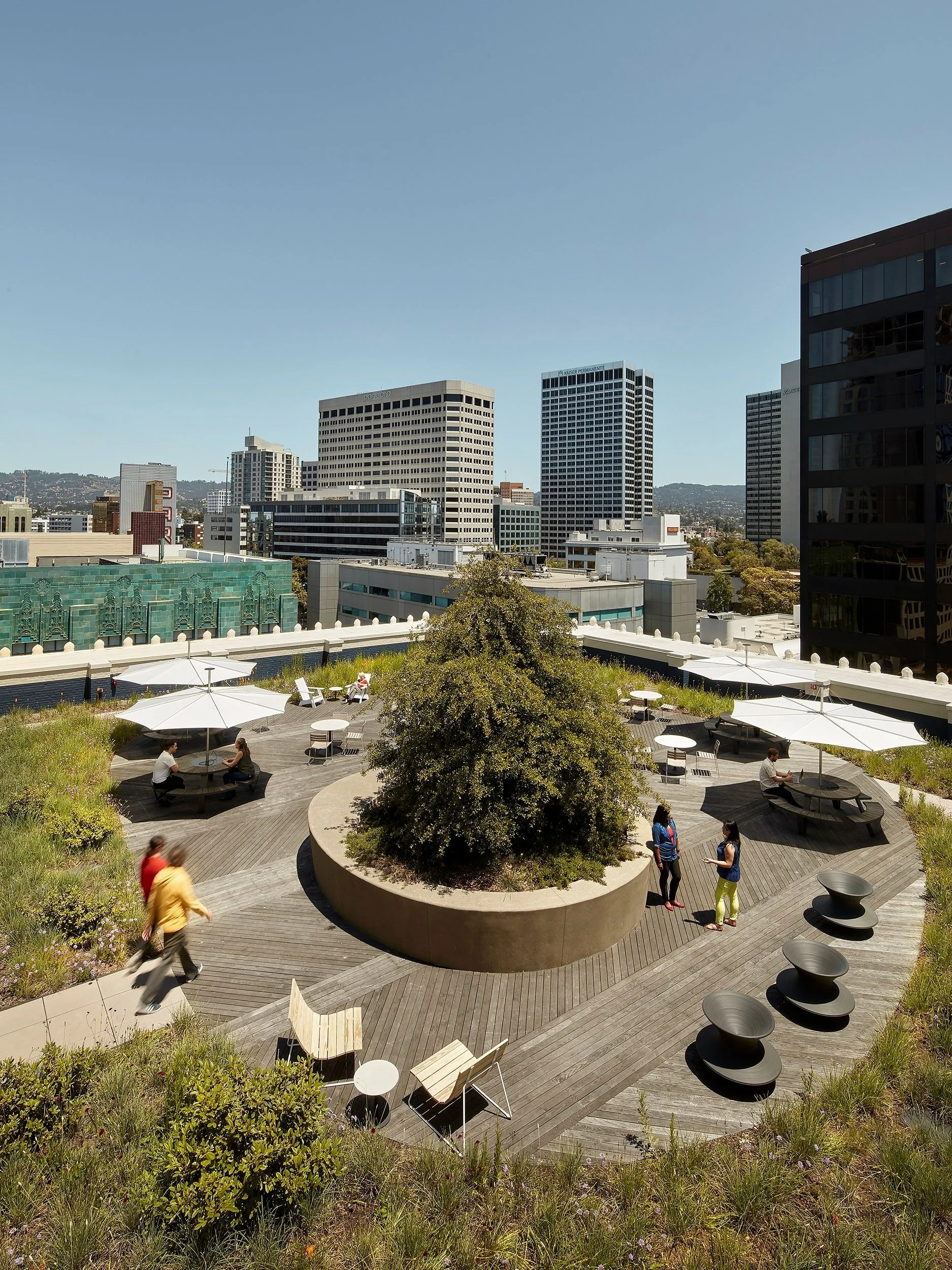
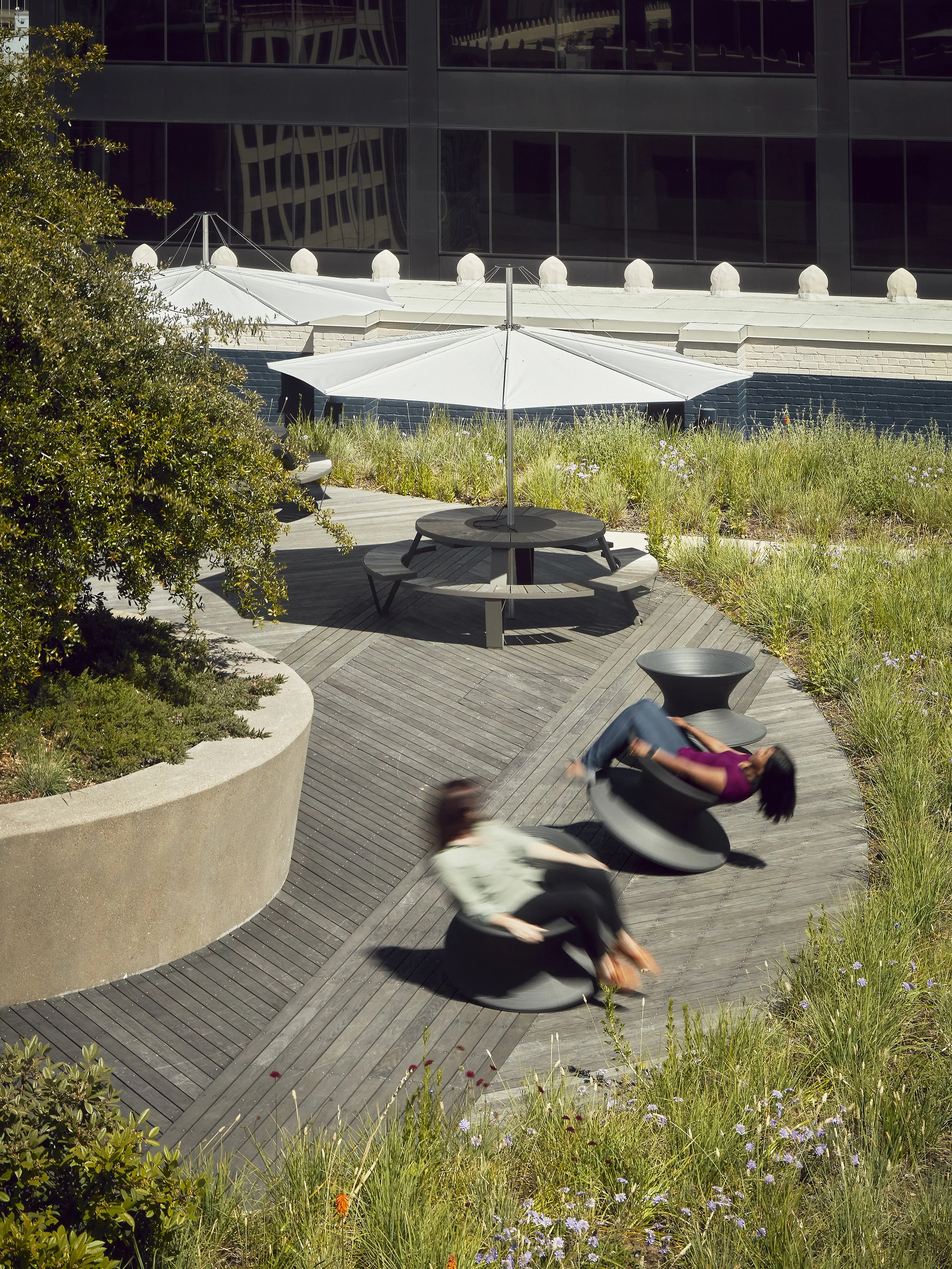
This project’s crown jewel is the city of Oakland itself, a beloved urban and natural landscape that is shown off by the office’s many outdoor spaces. Multiple wood-floor patios offer transporting vistas of the Bay Area skyline. To seduce workers to take a breath of fresh air, two chose sturdy outdoor furniture that can withstand the elements and have fun. We put the focus on natural tones, playfully curved lines, and basic utility.
Our resulting selections include easy-going pine-slatted Plank Loungers from Council, a local manufacturer; whimsical rotating Spun chairs by Magis in dark earthy brown; and a snappy umbrella-table-bench unit—all in one!—from Extremis, a Belgian outdoor furniture maker. Light-hearted and low-key, this open-air affair is impossible to resist.
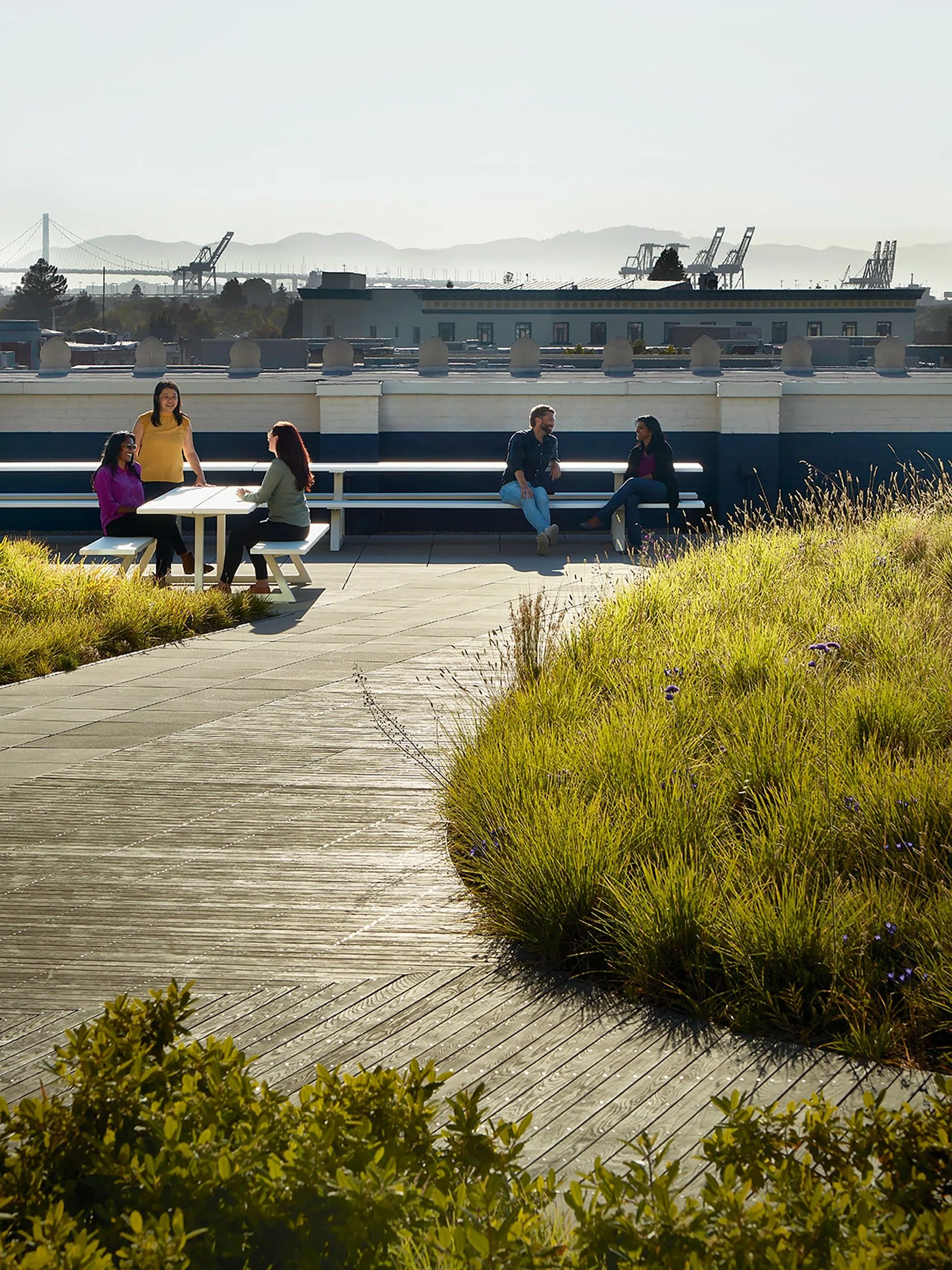
For a more intimate encounter with the sky, these smaller, upper-level outdoor areas deliver top-tier views amid native landscaping. Our furniture selections here prioritize crisp, modern lines and straight-ahead function. With individual and picnic-bench-style seating, these rooftop pieces suit casual collaboration, go-it-alone timeouts, or team lunches.
Mindful of the sun, we wanted to throw the right kind of shade—the kind offered by this jaunty parasol and awning pieces (above left). Both are built-in features of Extremis’ signature all-in-one units, each featuring seating, table, and sun shields. The clean white tones of these furnishings put the spotlight where it should be: on the panoramic views and natural flora.
All-hands-on-deck at a sleek shipshape café
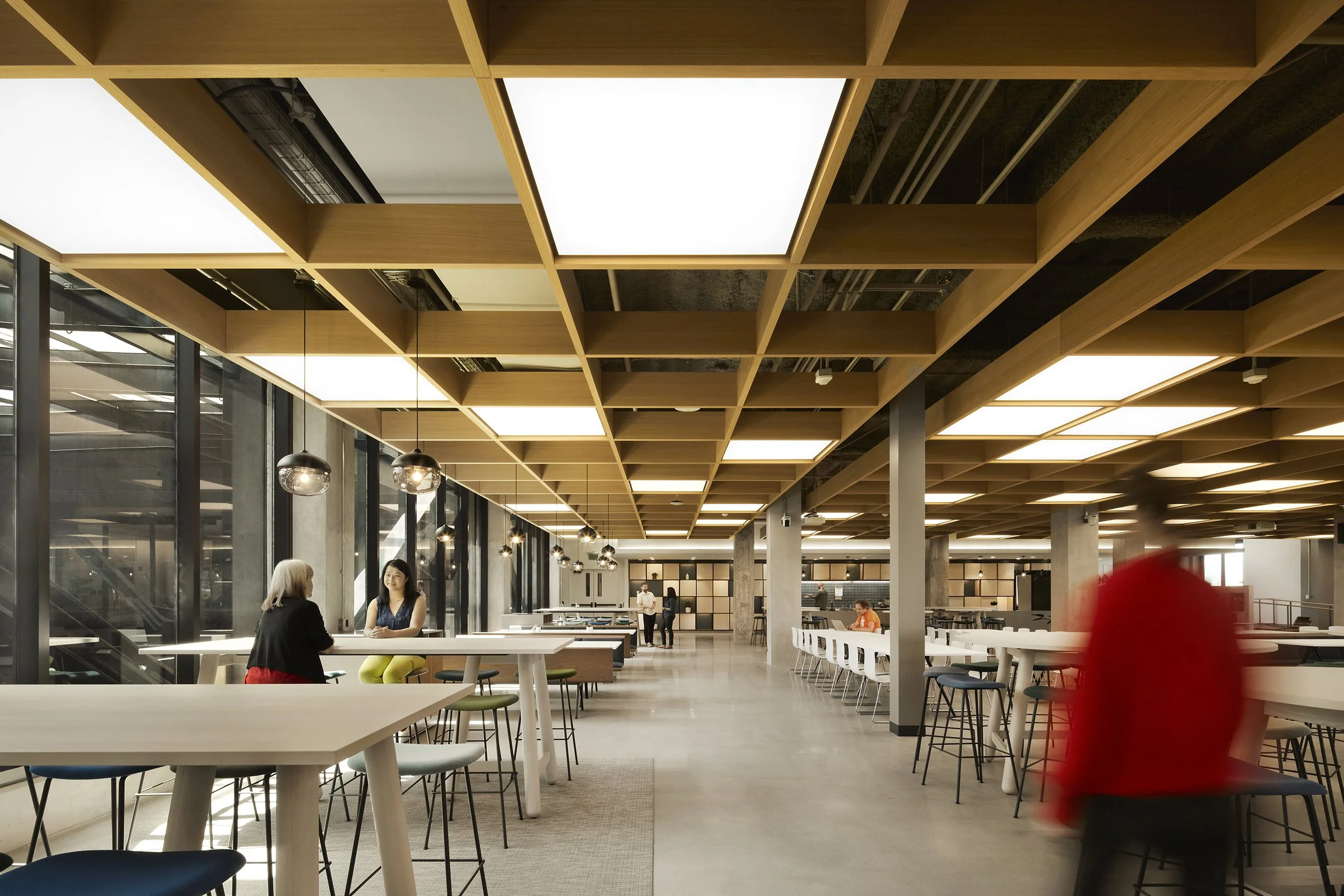
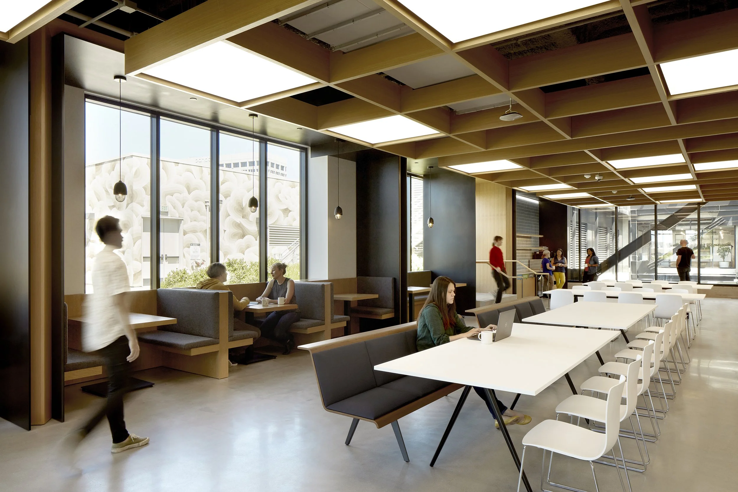
The office’s expansive café is designed to meet any all-hands let’s-work-over-lunch occasion. With chic ambience as a design priority, the space needed to work for crowds without feeling crowded or monotonous. Amplifying the strategy we used in smaller café spaces, we mixed together numerous tables and seating of different heights. We paired long restaurant tables with chairs and seat-backed benches, chunky work tables with stools, and small high-top tables with stools.
To level up the aesthetic of this high-volume space, a custom piece became the infectious inspiration for a strategic off-the-shelf hack. With the window-side custom millwork banquettes in mind, we selected gray seat-backed benches from Arper that matched the built-ins’ style, and then we customized their lengths.
To pull this big open area into conversation with the rest of the building, we incorporated textures, colors, and forms that repeat or are echoed elsewhere in the office. The round white tables from DUM and backless bar stools from Muuto, pictured above, are the same as those that appear in the smaller corridor-space café. These familiar pieces signal the overall design vision and enact comforting patterns of association. At the same time, pointed variations—high and low seating, different colored stool seats—enliven and distinguish this particular space.
Coming home to Oakland

