two's Custom Work at Dropbox HQ
by Pearl Lopez
Custom furniture is one of the things two does best.
For Dropbox HQ, we pushed this skill set even farther—traveling that line between the built environment and furniture. In addition to creating custom tables, sofas, and rugs we also designed and coordinated the manufacturing and installation of wall systems, fixed shelving, and amphitheater-size seating systems.
Because Dropbox is the leader of ‘working-in-the-cloud,’ clouds themselves were our design partner, Johnston Marklee’s principal reference point. The overarching design language of the project incorporated curves and scalloped shapes into almost every detail. Dropbox employees are literally working in the cloud.
I’m Pearl, two’s Creative Manager, throughout the Dropbox HQ project I led our team of ancillary specialists while also managing the client and designer relationships. Below are nine examples of the custom work we did for Dropbox HQ with a bit of my own reflection about each.
Scalloped Metal Library Shelves
Photography: Thibault Cartier
“Most of the time when people think of libraries, they’re imagining heavy wood-filled spaces with straight shelves. The approach that Johnson Markley, the architect, took for Dropbox’s library was entirely different, it’s framed with scalloped bright yellow metal shelving.
This concept presented unique challenges for our team. We worked very closely with the fabricator to achieve the design intent, utilizing a diamond pattern mesh metal that was bent into curves along the main shelving structure to make what are essentially scalloped walls with shelving.
Bringing the library shelves to life required so much coordination between our team, the architects, contractors, fabricators, and installation team— it was really a labor of love.”
Images of material and shape palette.
Photography: two furnish
Sound-dampening Workstation Dividers
Photography: Thibault Cartier
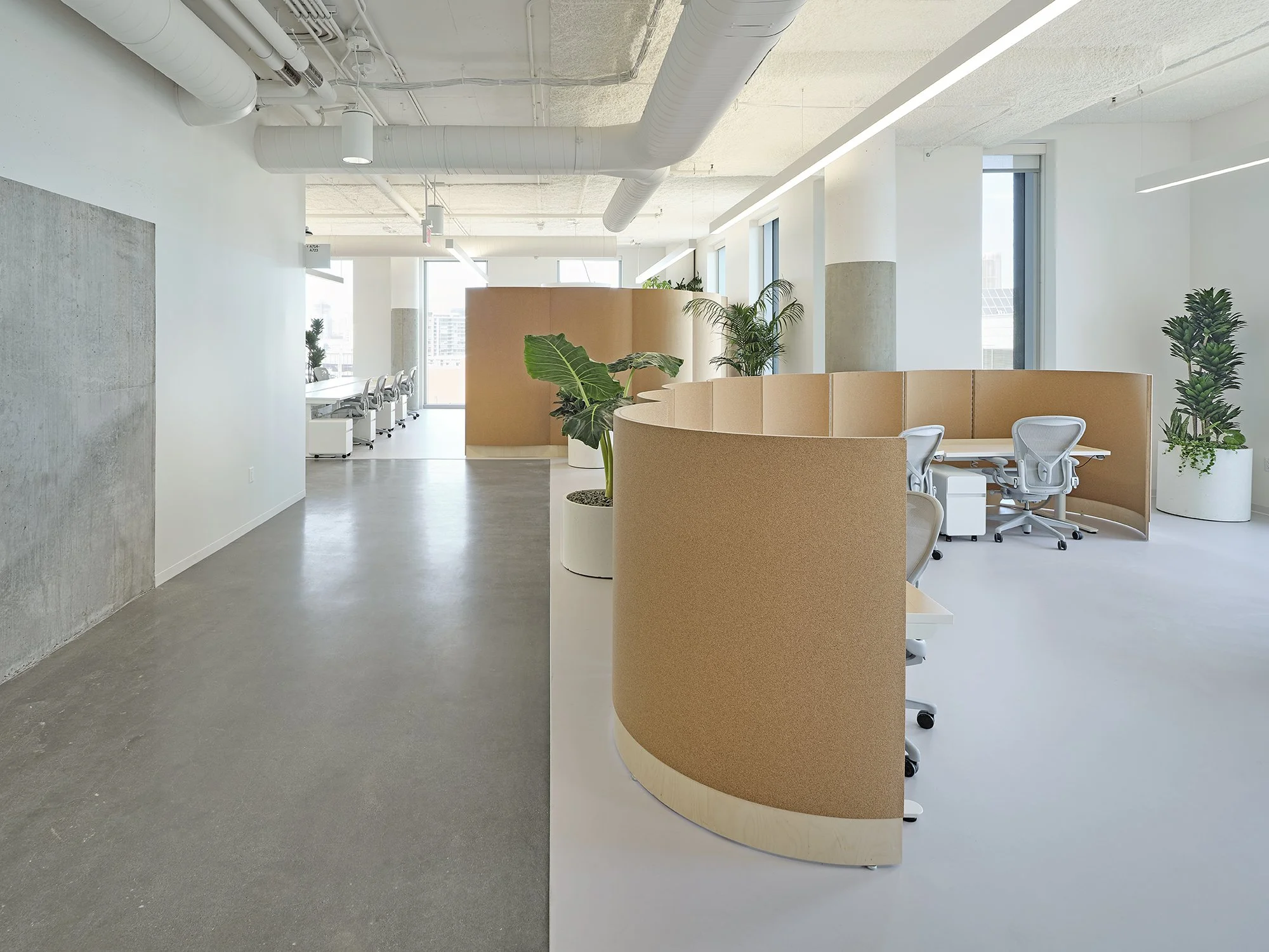
“Oftentimes in offices someone’s desk ends up in what is considered the circulation path, and it makes them feel very much on display. But how do you give somebody a bit of privacy while not impacting the circulation space? We designed a really pretty architectural element— lower scallop-shaped cork walls that create a bit of separation, while dampening sound, and providing an additional surface to pin notes and ideas to.
In other areas of the office we designed very tall scalloped cork walls to create informal meeting rooms within the open environment. All of these additional cork surfaces really help control noise in such an open office space.”
Drawings: C.W Keller & Associates Inc. for two furnish
Movable Atrium Seating
Photography: Thibault Cartier
Initial concept drawings: two furnish
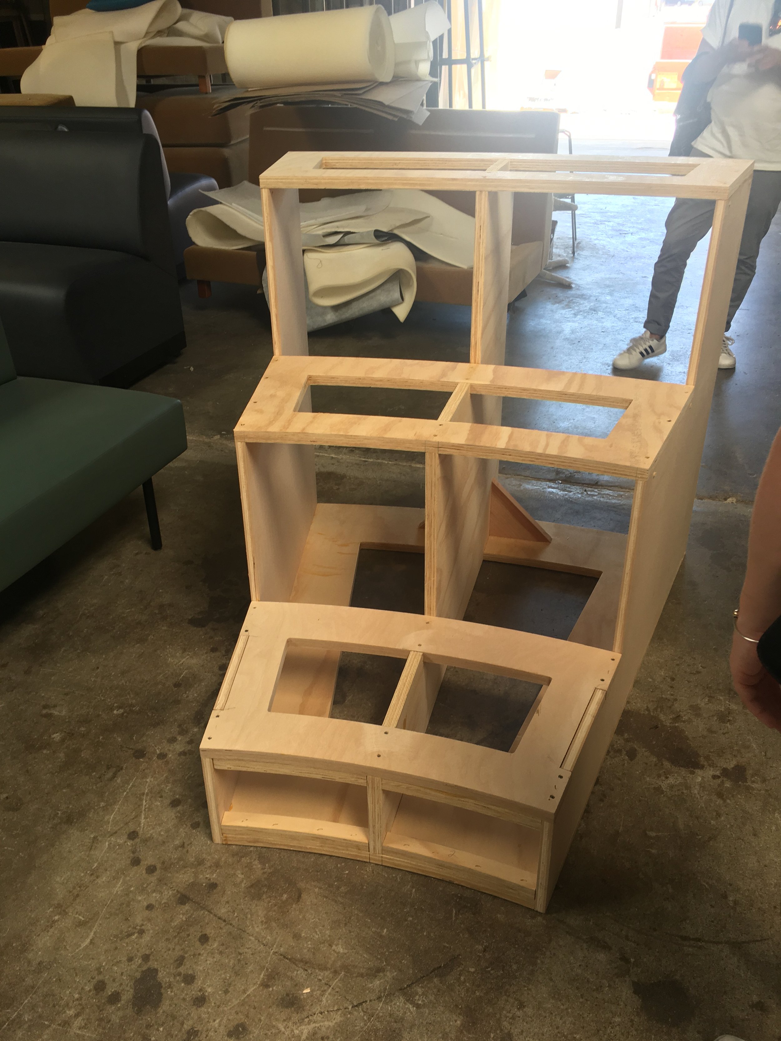
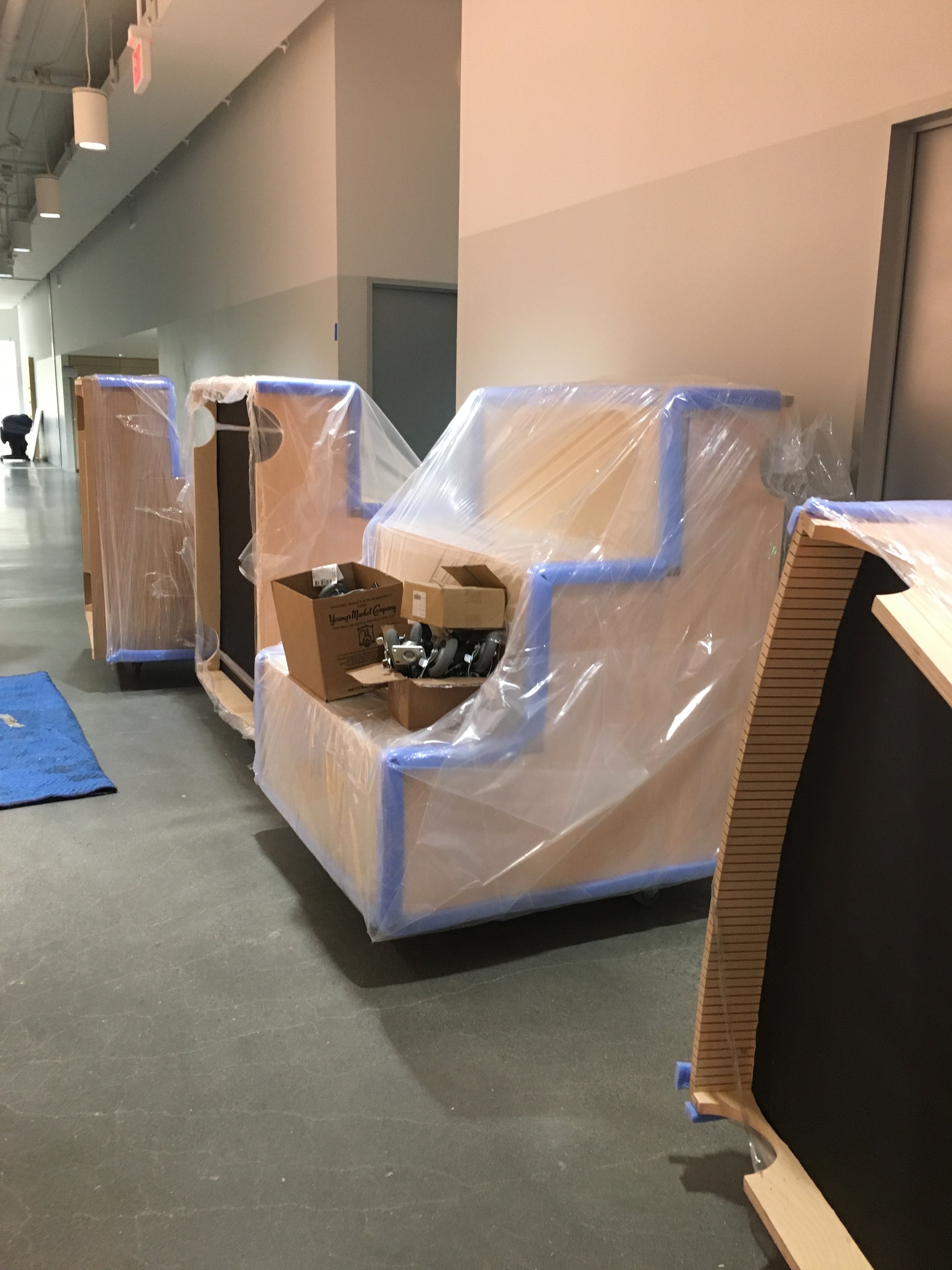
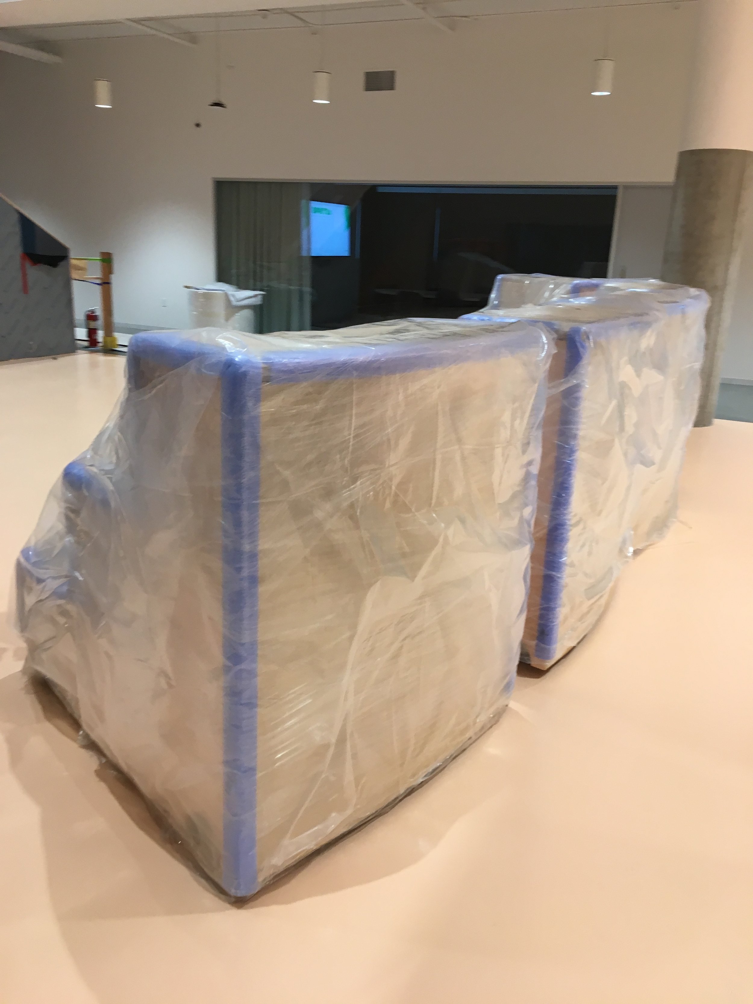
“Creating an easily-movable elegant system was so important here. We wanted the seating to look very streamlined and not industrial while still being really user friendly.
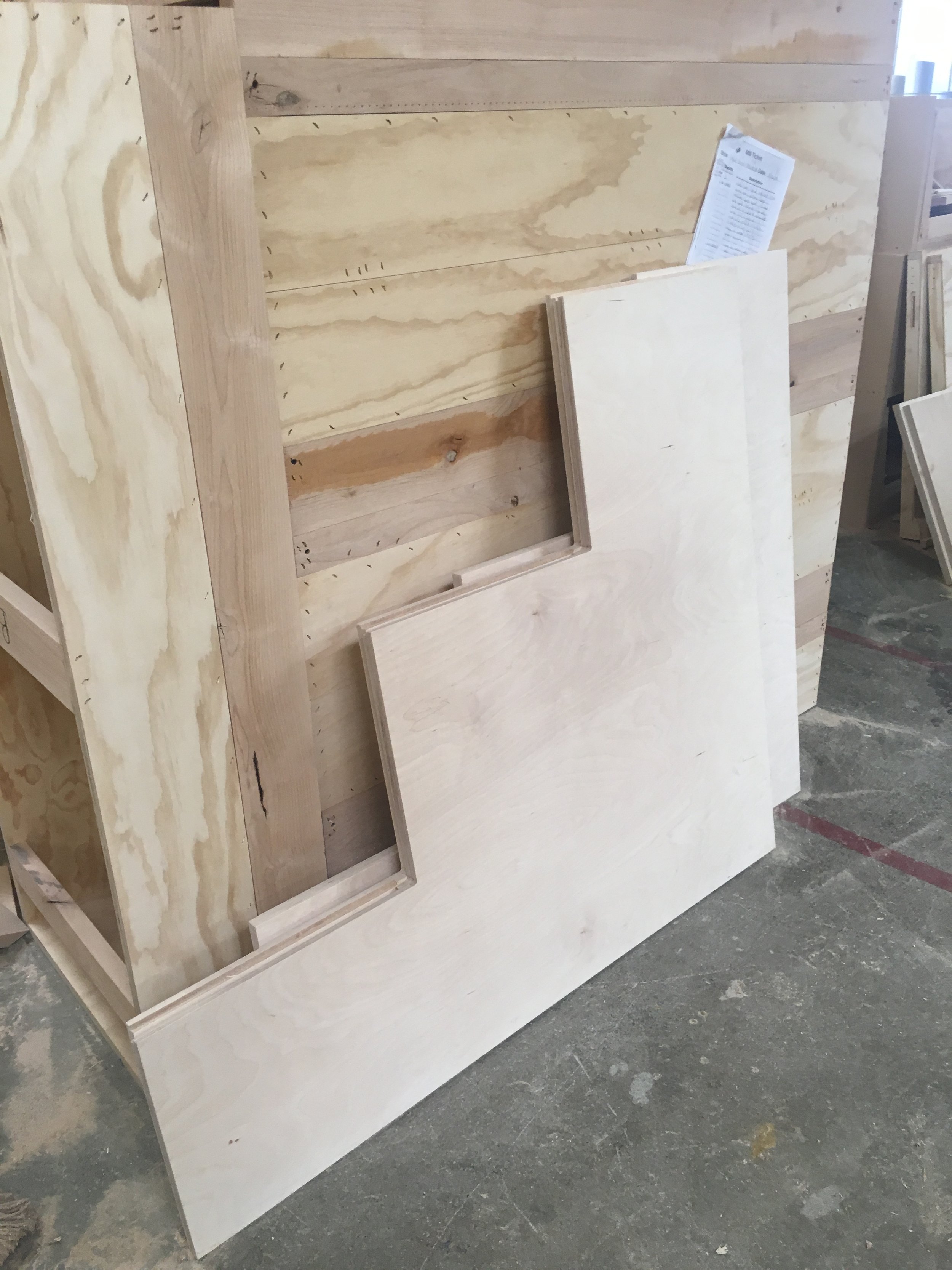
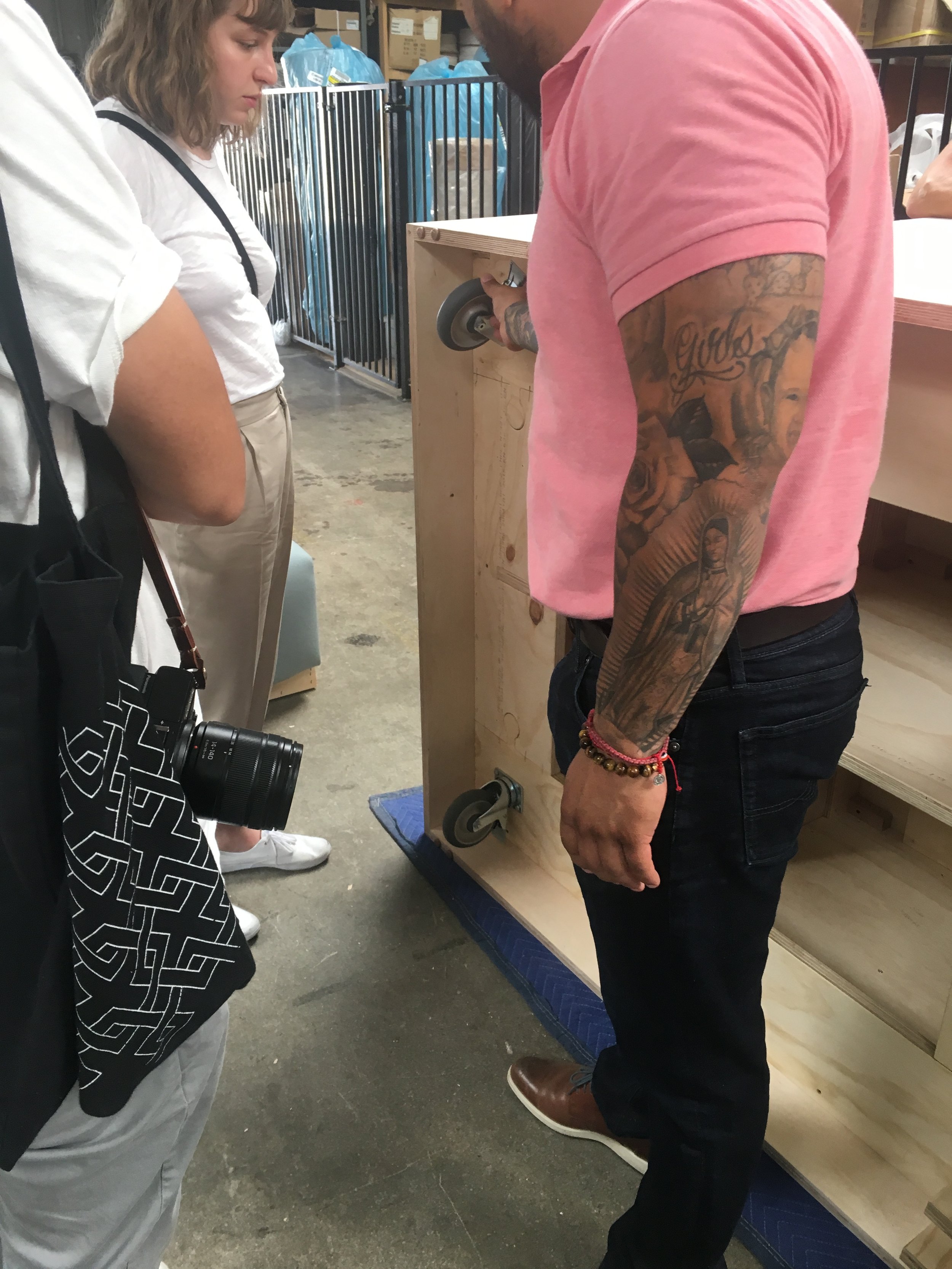
We worked hard to make sure that facilities or somebody could move the modules around easily. So, the casters had to be really durable but not bulky or ‘in-your-face’. They also had to lock so the benches were stable. To achieve this, we created a really cool break with a foot pedal and then recessed the casters a bit inside so you could still have the ability to move them.”
Focus Corrals
Photography: Thibault Cartier
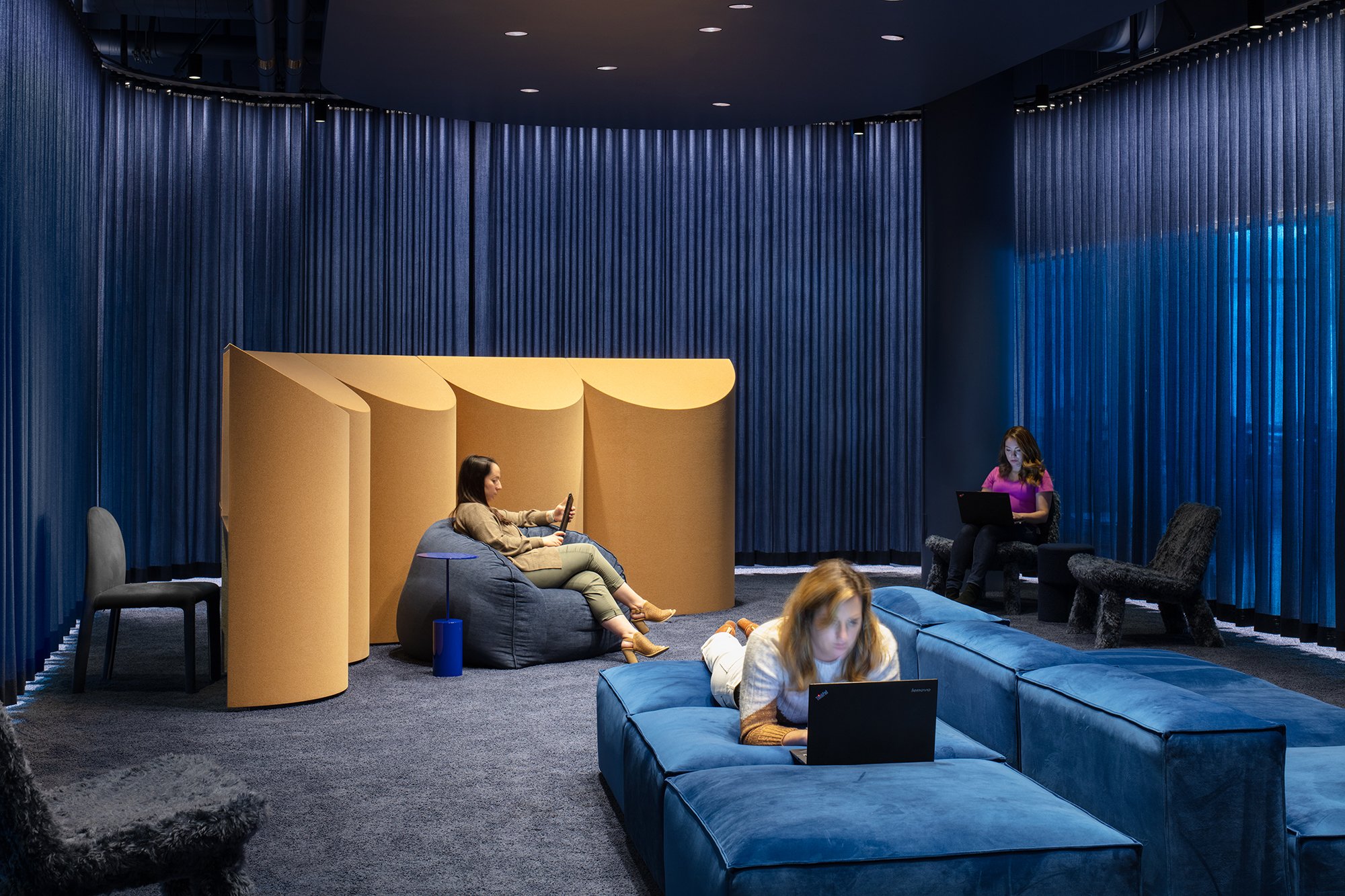
“The focus corrals are a modern adaptation of your typical study where you can do focused heads down work. They were designed for the study, which unlike the sunny library, is a darker, moodier, deep focus space. Different people obviously have different work styles. Engineers tend to like to have things a little bit darker versus some people who find being in lightfelt spaces a better environment for them to work. So these spaces are always considered in tandem.
Here, we used cork on the exterior and felt on the interior. Both of these materials offer a high level of sound absorption. So it really allows you to create that nice cocoon for focus. We repeated the scallop shape that's found throughout the entire space. So, they add a nice buffer but also a really interesting architectural detail. And the color of the cork warms up the dark blue space.”
Initial concept drawings and renderings: two furnish
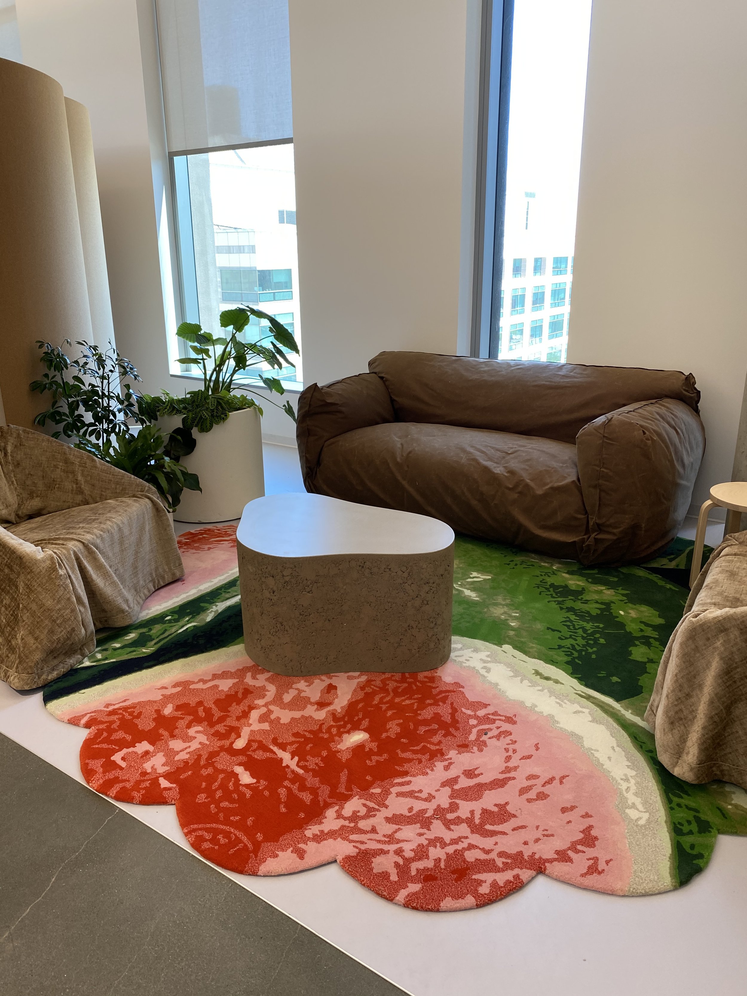
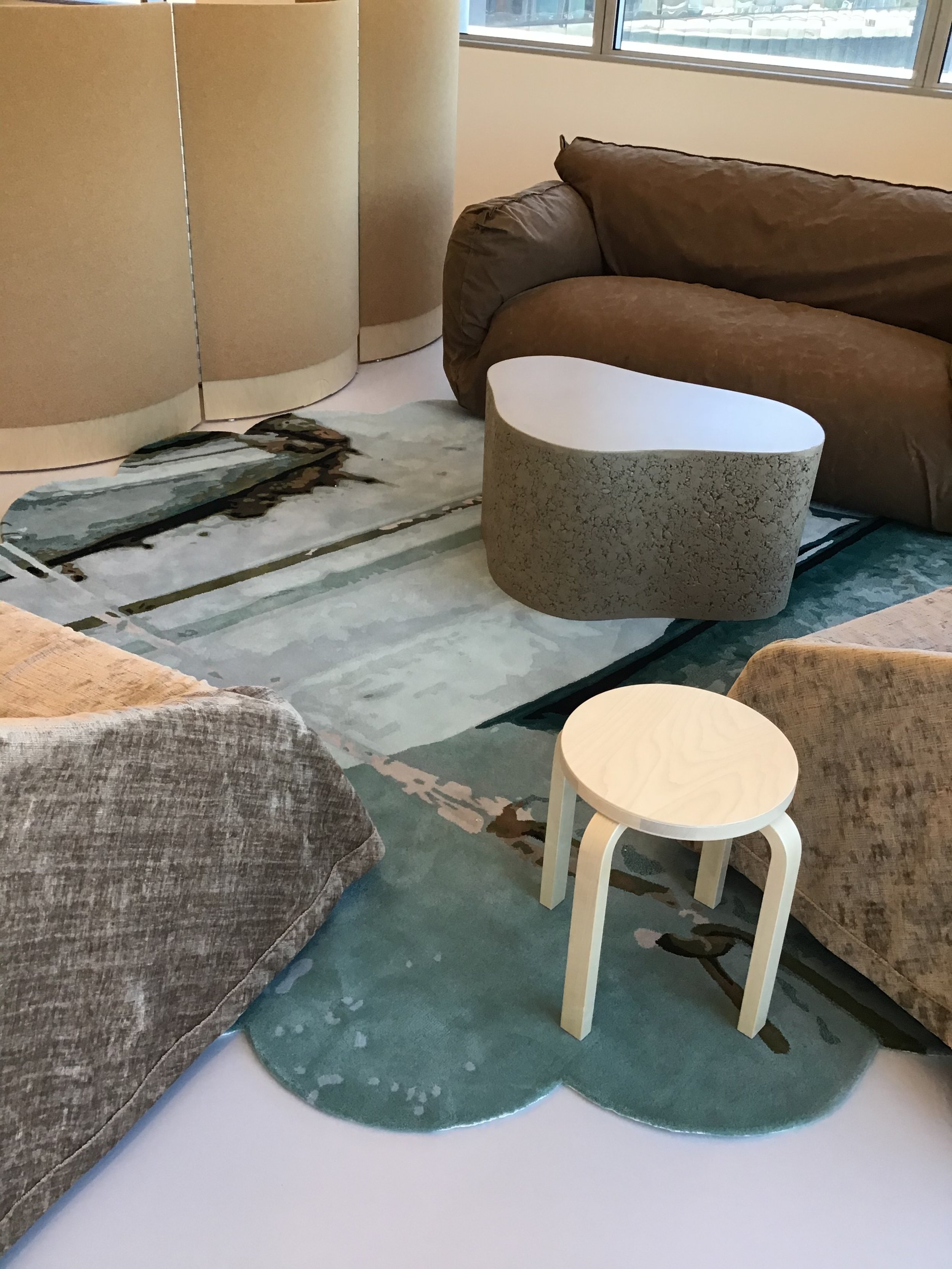
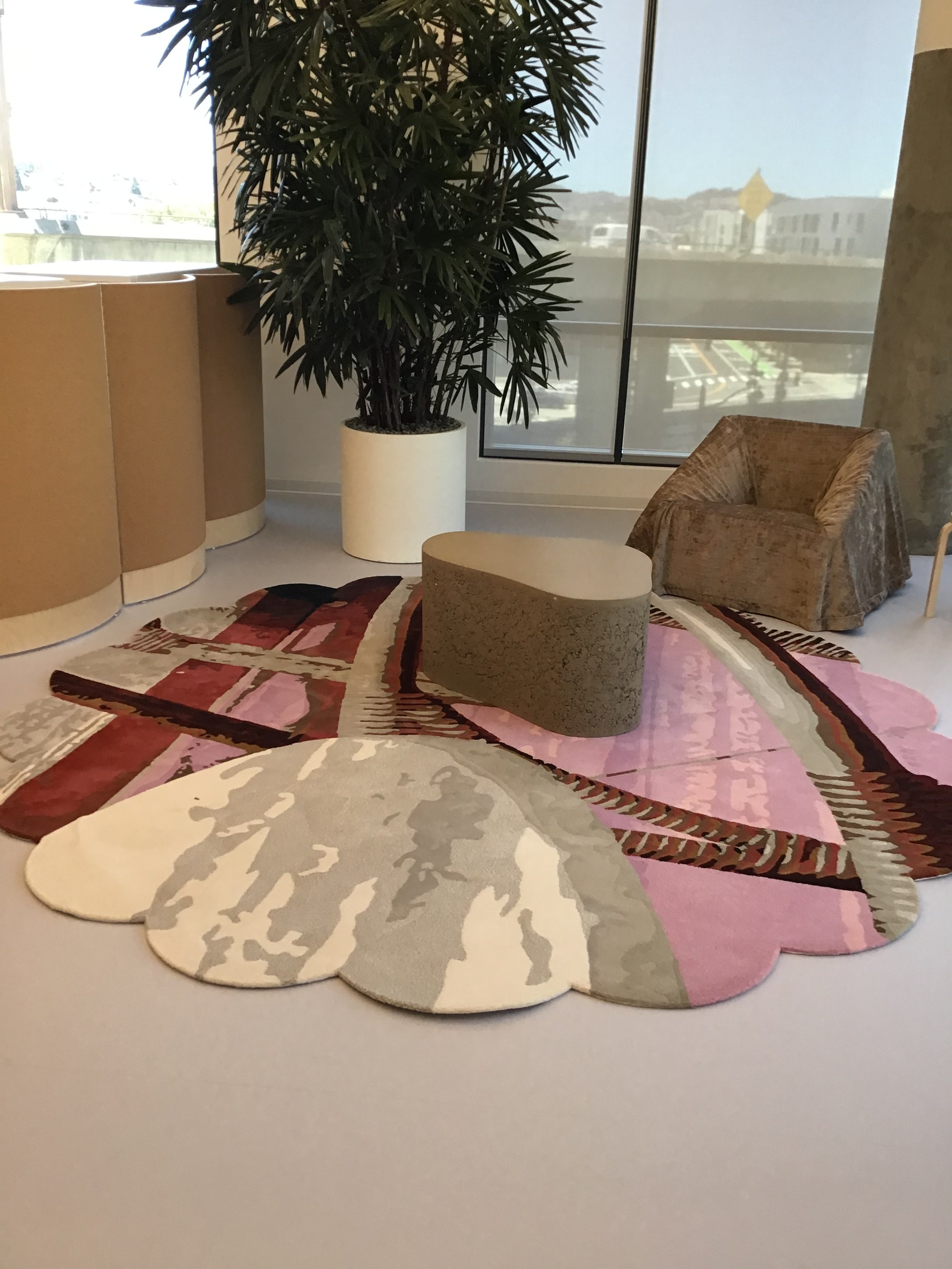
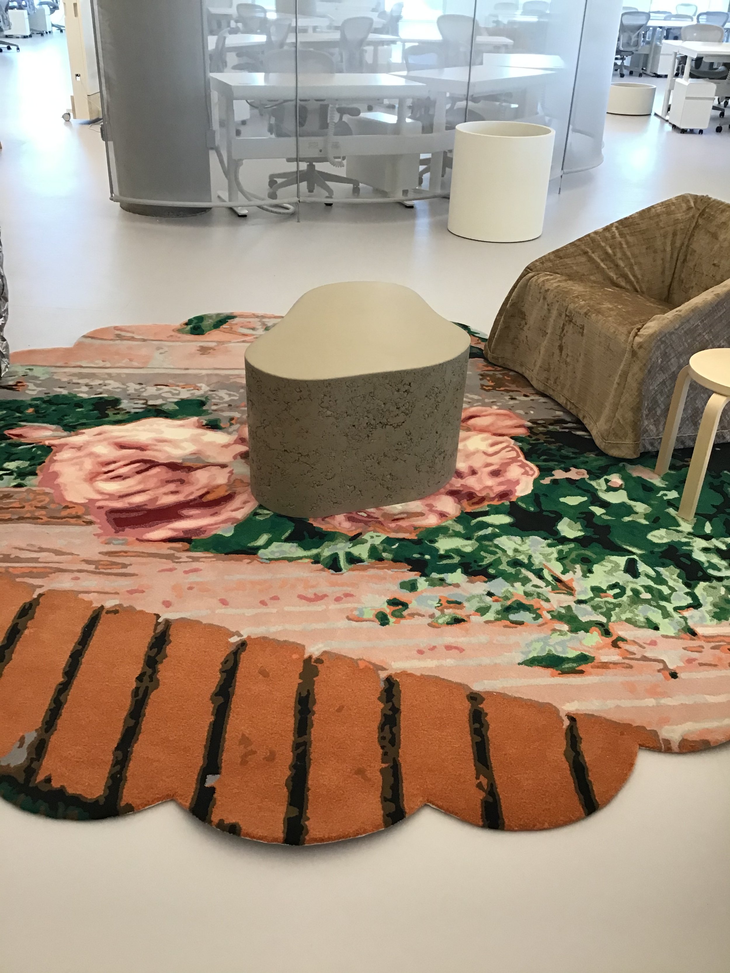
Photo-inspired Nodi Rugs
Photography: Thibault Cartier
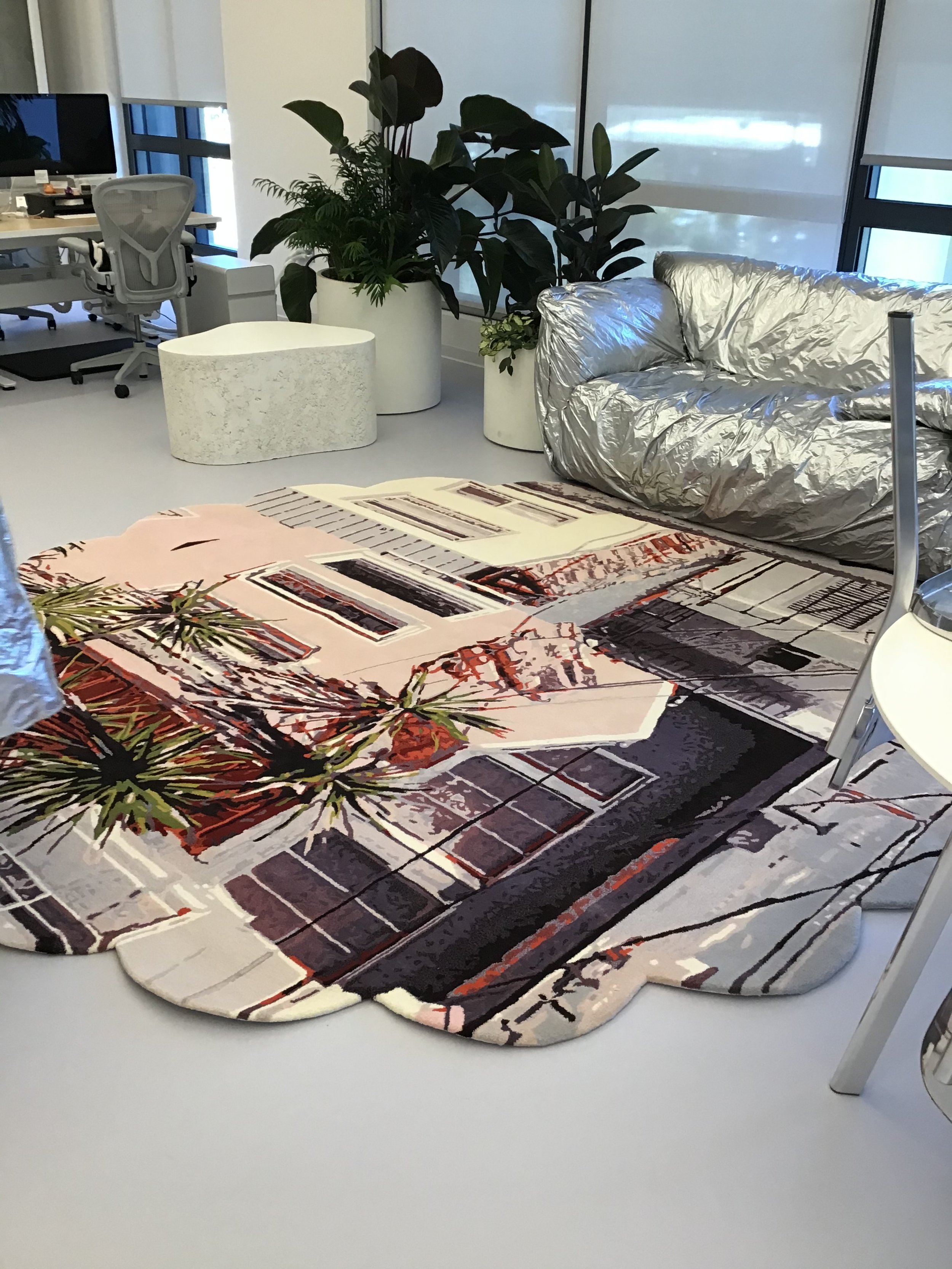
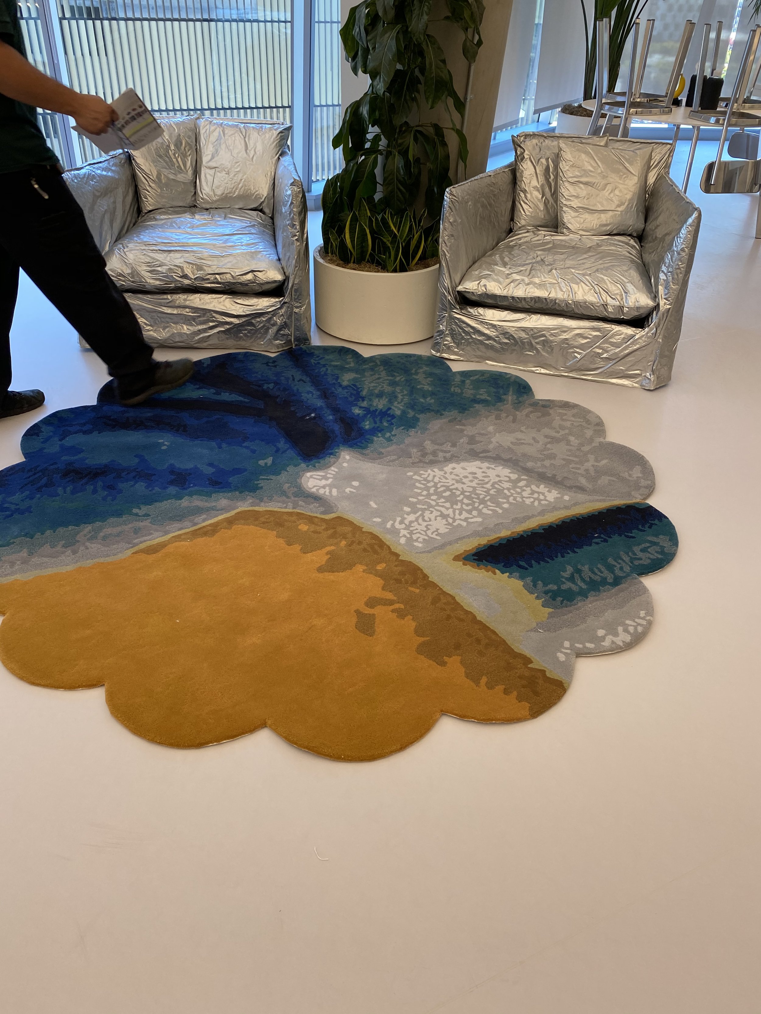
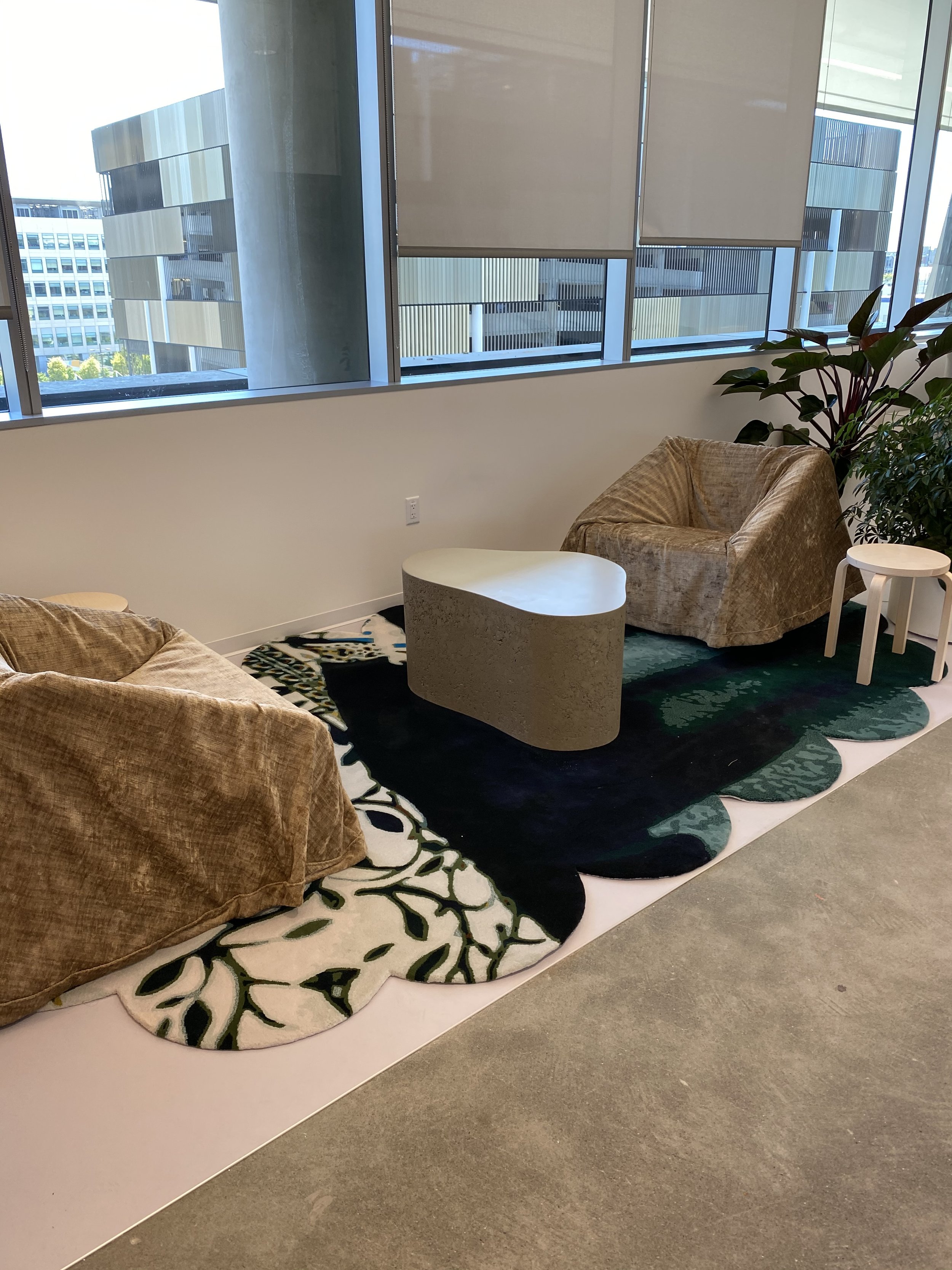
“Creating these rugs was so much fun, and also talk about a labor of love! Each of these rugs were created from photographs taken by a member of the Dropbox Black Ops team, making the whole space very personal. He's a wonderful photographer, and we looked at all of his photographs and decided to use them as the pattern for the rugs. But rather than creating a one-to-one, ‘here's the photograph and here's the rug’, our design team isolated, detailed, and adjusted the scale of a small portion of each photograph. This created a bit more of a pixelated effect.”
Rug placement and planning drawings: two furnish
“A lot of the rugs reference either the Bay Area or Dropbox culture. One of the rugs is an image of a watermelon, which are popular and a big part of the Dropbox culture. One of the founders is very fond of watermelons. He would dress up like a watermelon for Halloween. Another is of one of the founders and his cat. You can just make out the profile of the cat, its shape, but it doesn’t scream CAT. So each has a little personal cultural moment, but nothing that’s hugely obvious.
If you step back a little, you might see parts of different computer equipment, or part of a building. This was the really fun part of figuring out each rug design— what the pattern would be, and then working closely with our manufacturer to actually fulfill and create each unique piece. There were so many details and colors and really specific shapes, we were thrilled they were up to the challenge.”
Learning Sofa & Cloud Table
Photography: Thibault Cartier
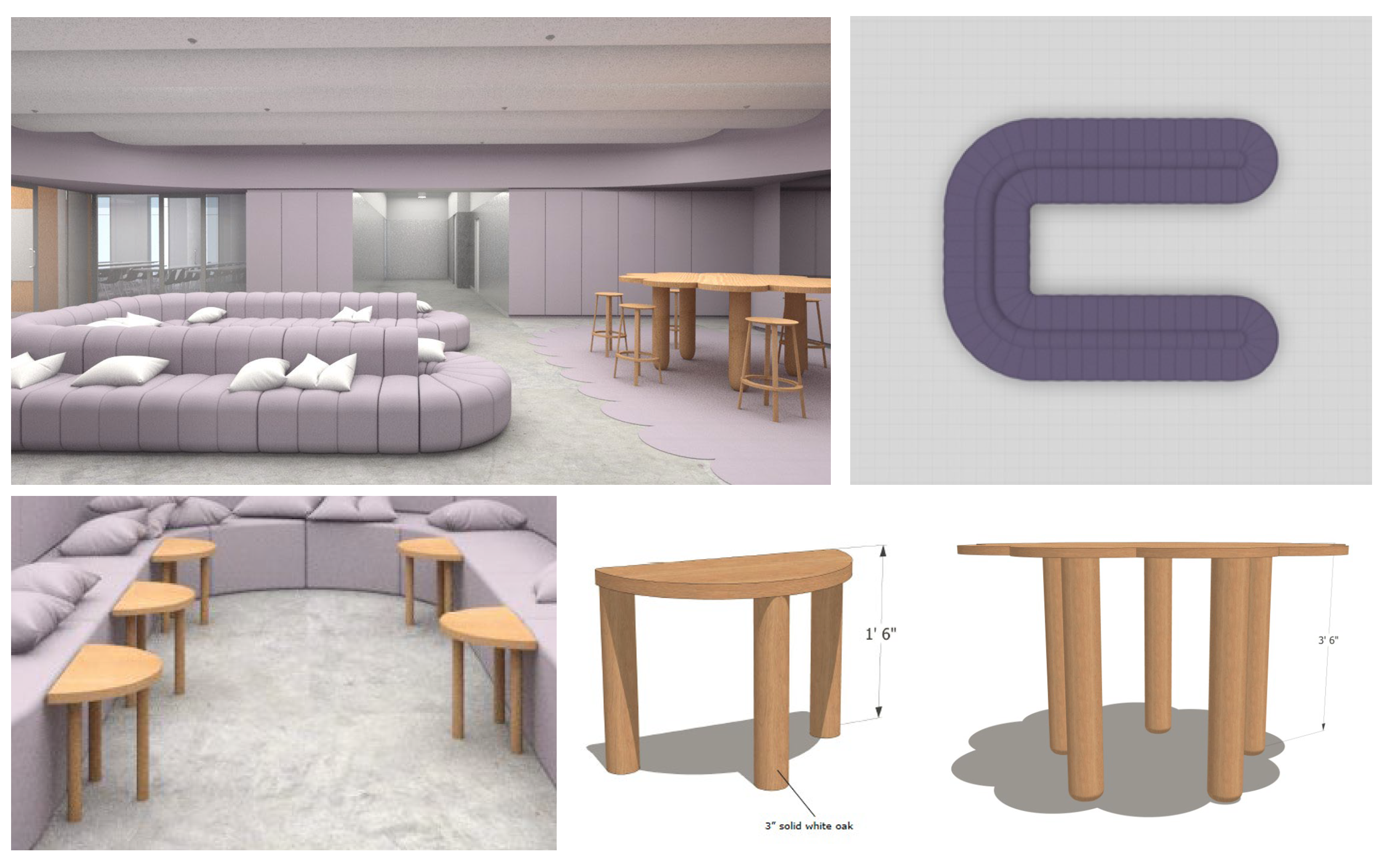
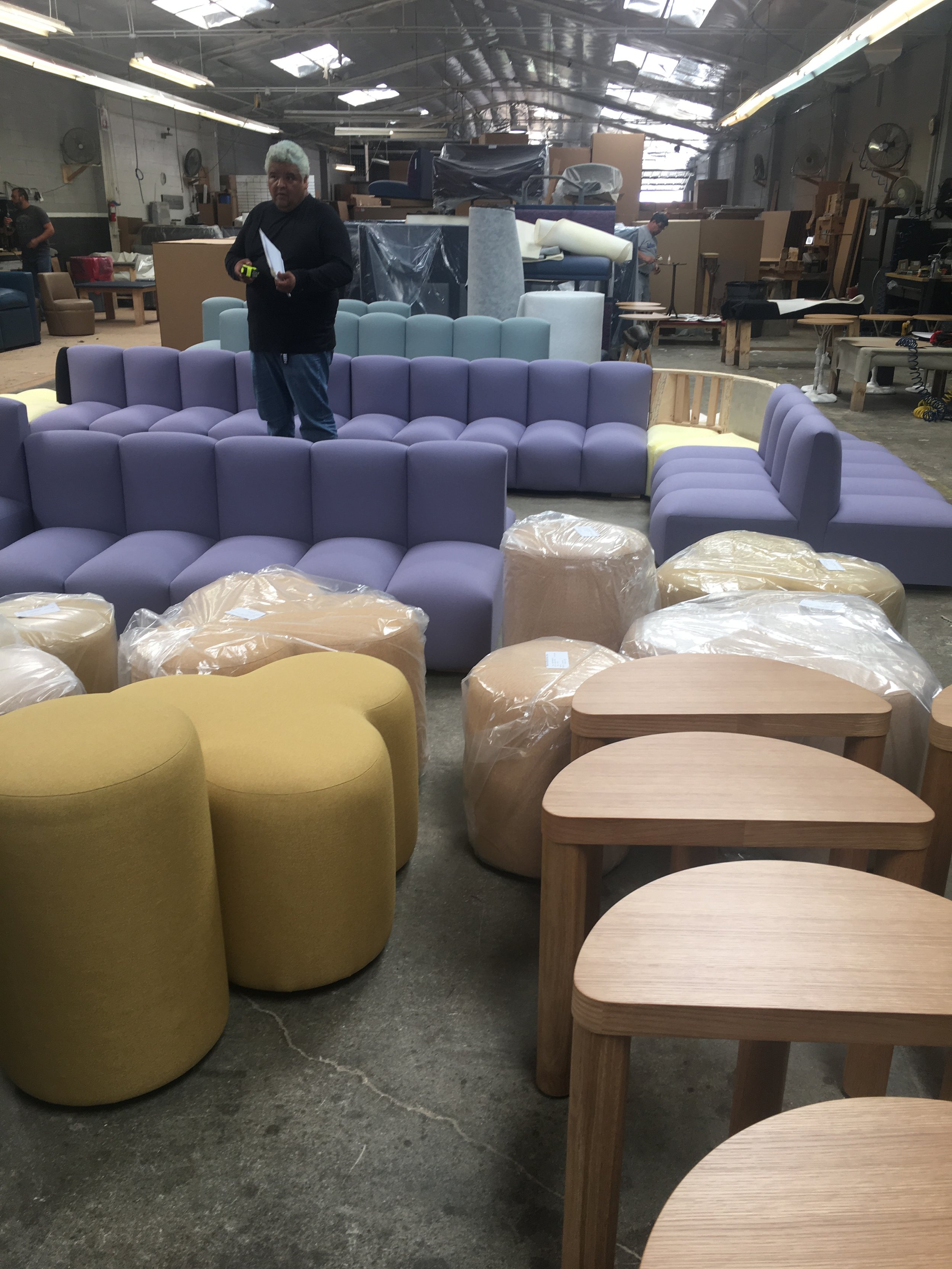
“Continuing with the curve motif, here we literally created a table that we called the Cloud Table, which was manufactured in wood as well as metal by a California company down in LA called The Tank. They were designed to be a good place for people to sit around and collaborate. We also designed smaller, shorter versions that resemble parts of the cloud that have been broken off and function as little side tables along the inside of the big Learning Sofa.”
Concept renderings: two furnish
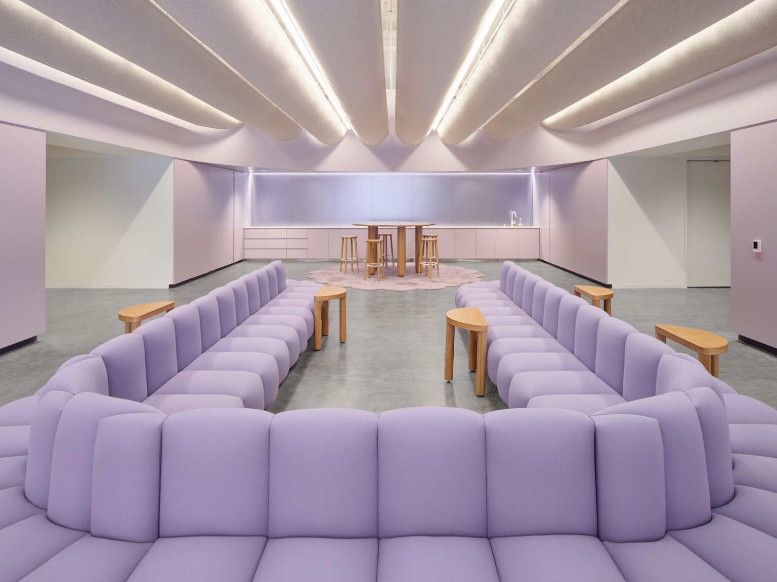
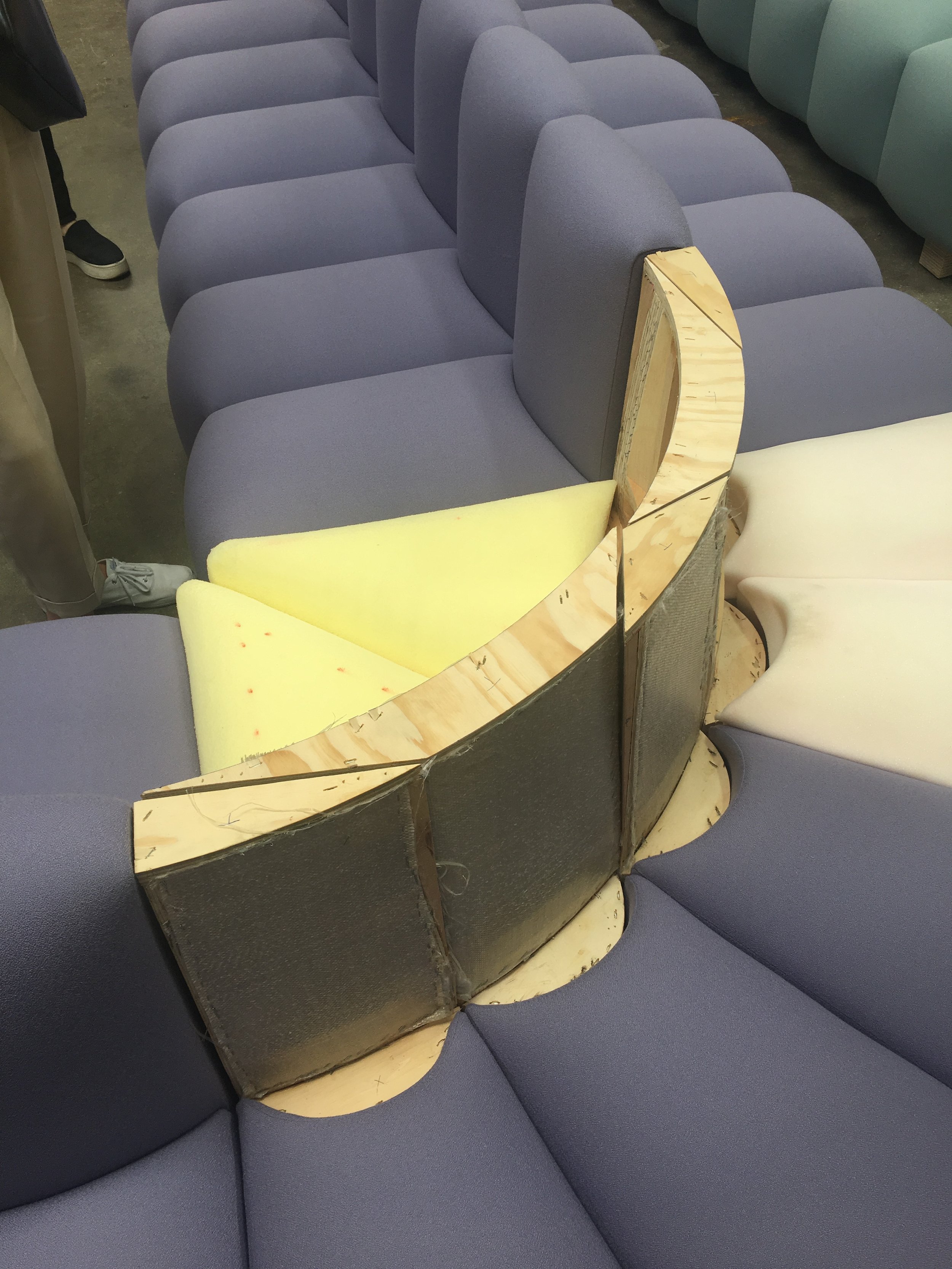
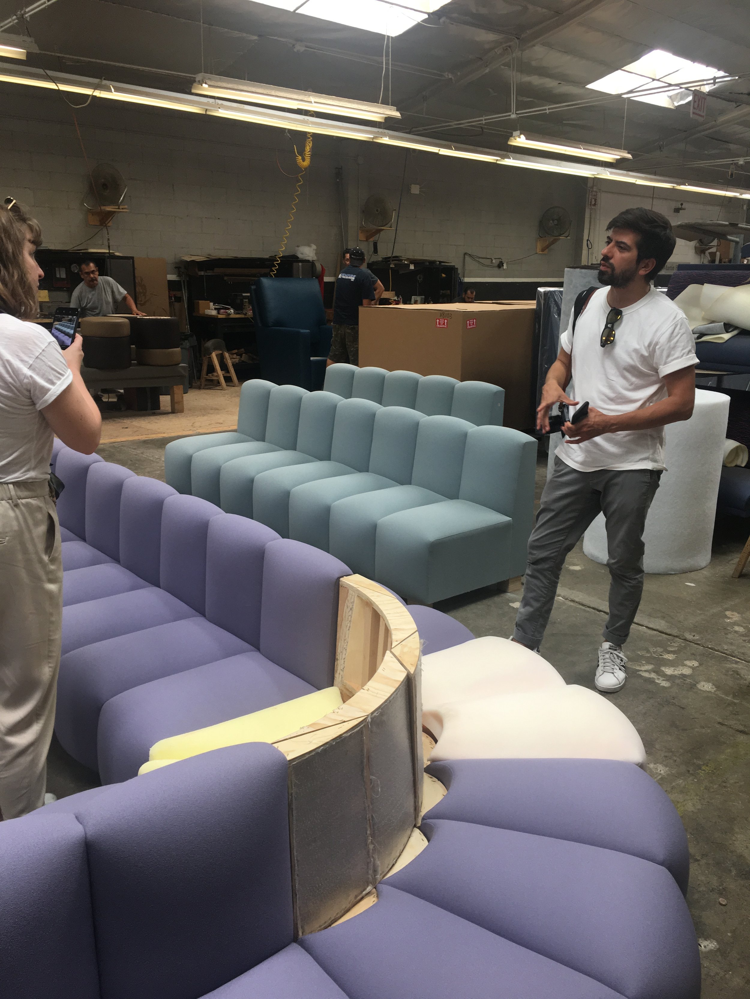
“The U-shaped purple Learning Sofa was designed to be a gathering space since it’s in a room that’s located in the center of a bunch of different training rooms. So, whether you're being on-boarded for the first time, or coming back to learn something, or in a long training session, this break space in the middle is designed for gatherings or a little snack break. It's meant to be a good place for people to lounge and relax a little bit outside of their very formal training environments. The sofa also has outlets so someone could plug in their laptop and get a little bit of work done.
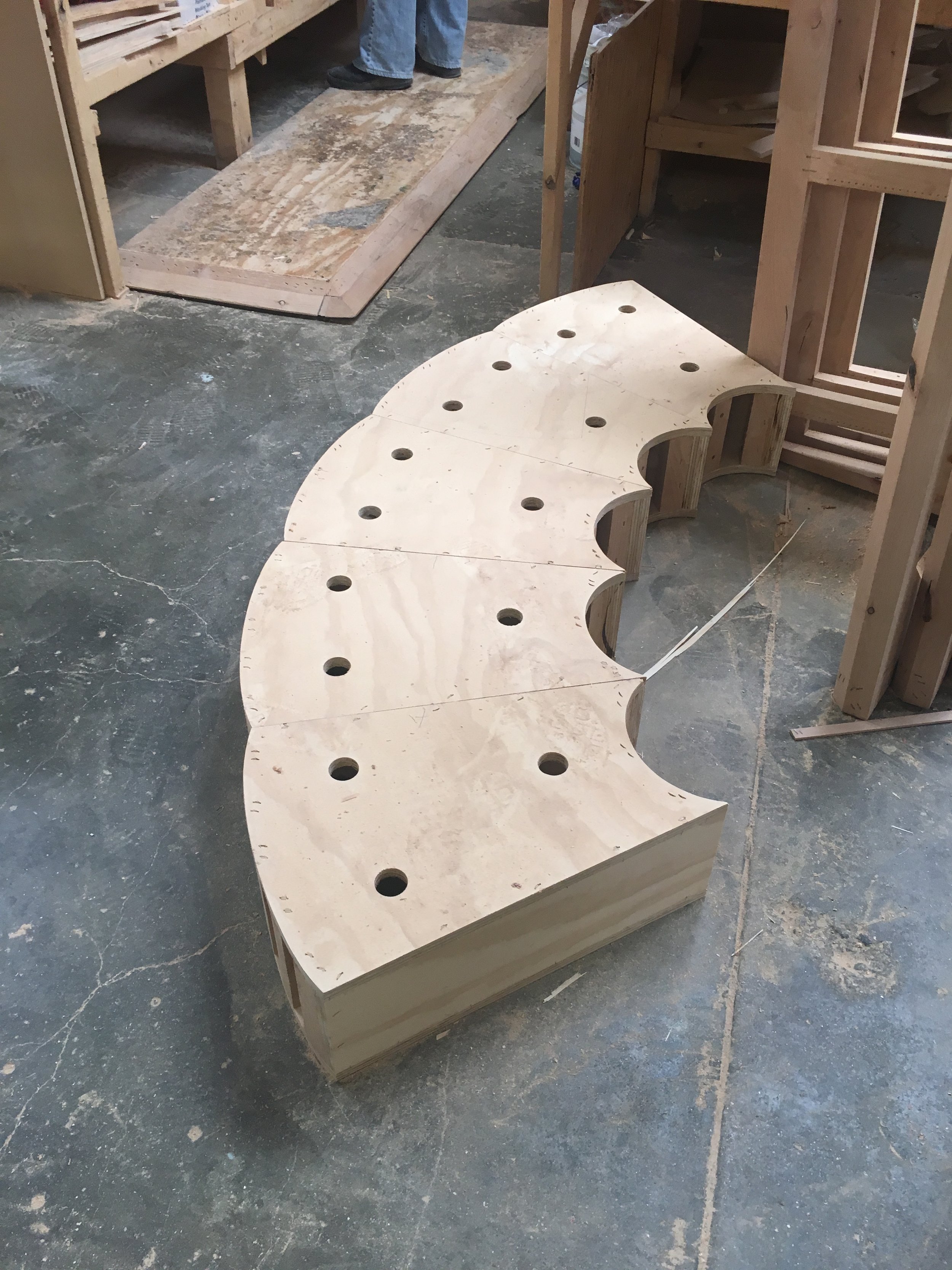
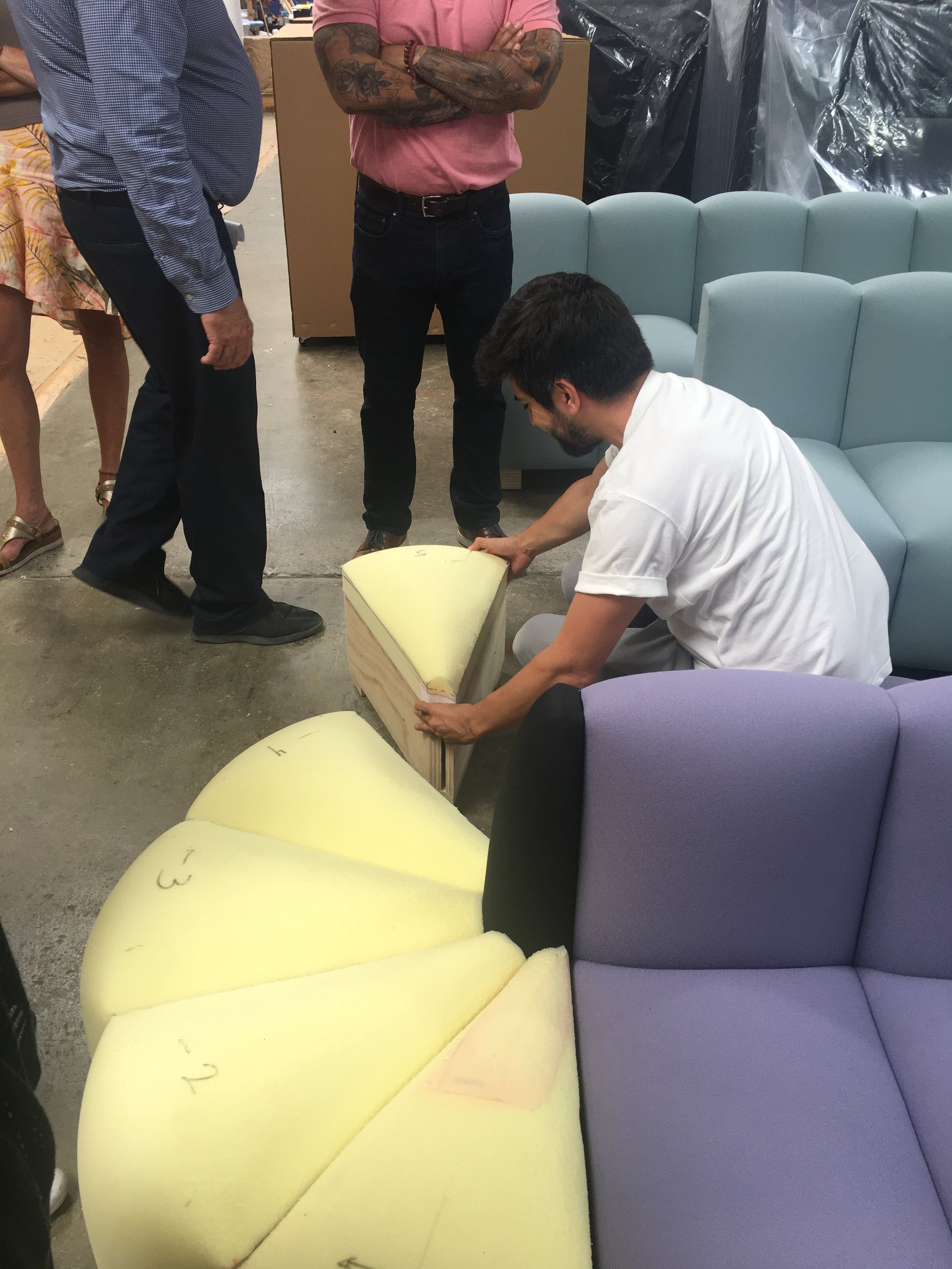
The sofa was manufactured by Martin Brattrud. They did, I would say, the majority of all of our upholstered pieces throughout the entire space. It’s massive, but made in pieces, so it could be reconfigured, shortened, or modified as needed should the space evolve or change.”
Power-enabled Dropstop Table
Photography: Thibault Cartier
“This is the metal version of the Cloud Table, which has a similar shape, but by changing the materiality, the look and feel also change. The finishing is a bit textured- it isn’t shiny or polished, which was intentional to fit with the overall material palette of the project that included more basic construction materials like metal mesh, felt, plywood, cork. We didn’t use really high-end or glossy materials for Dropbox.”
Table layout and power source drawings: two furnish
“The power-enabled metal cloud table was created for the Dropstop space, which is where employees can take their computer or devices if they are having technical issues. The aesthetic of the whole space references a doctor’s office.”
Pop-up Cushions & Artek Table
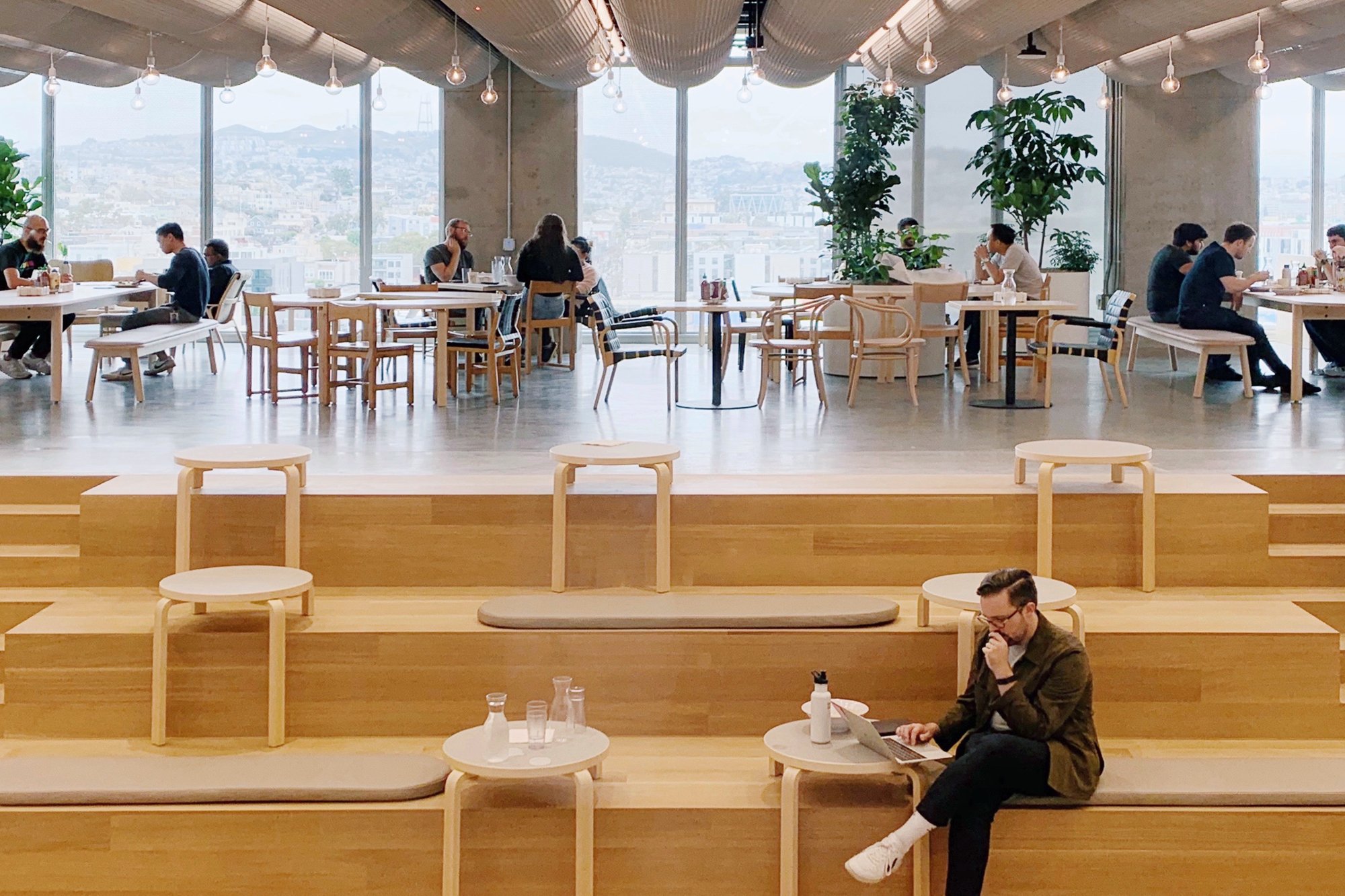
“Many large offices have stadium seating similar to this space at Dropbox. It’s a space that’s always super popular. We loved that this particular area was placed adjacent to the cafeteira, which meant it would get used and seen every day, all day. This seating is also used during all-hands meetings, so we really wanted to make sure that whatever we designed for this area could work for different uses.”
Photography: Thibault Cartier
“The cushions were created by K Chesterfield, which is a small, local business in the East Bay. The tables are Vitra Artek tables, and we adapted each individually so the size of the legs could straddle the steps. This was something that required a lot of very last minute coordination. The legs couldn’t be cut in advance just in case there was a different final measurement or problem with construction. Imagine, you receive your construction drawings and somebody says that the size of something is supposed to be a foot, but when you get to the site it's like half an inch taller or shorter. We knew we could not make that kind of mistake, so we had a local fabricator on site to cut each leg ensuring the measurement was dead-on accurate.
We were able to install the tables just before Dropbox opened up for business. It was one of our very last install tasks, which had to happen after the stadium seating was 100% complete. Because the table manufacturer, Vitra, is not based in the US, we couldn’t risk the mistake of cutting at the incorrect length and risking a long wait-time to get new tables shipped in.”
Pop-up Cushions & Artek Table detailing: two furnish
Vintage Rugs for the Mint
Photography: Chad Davis
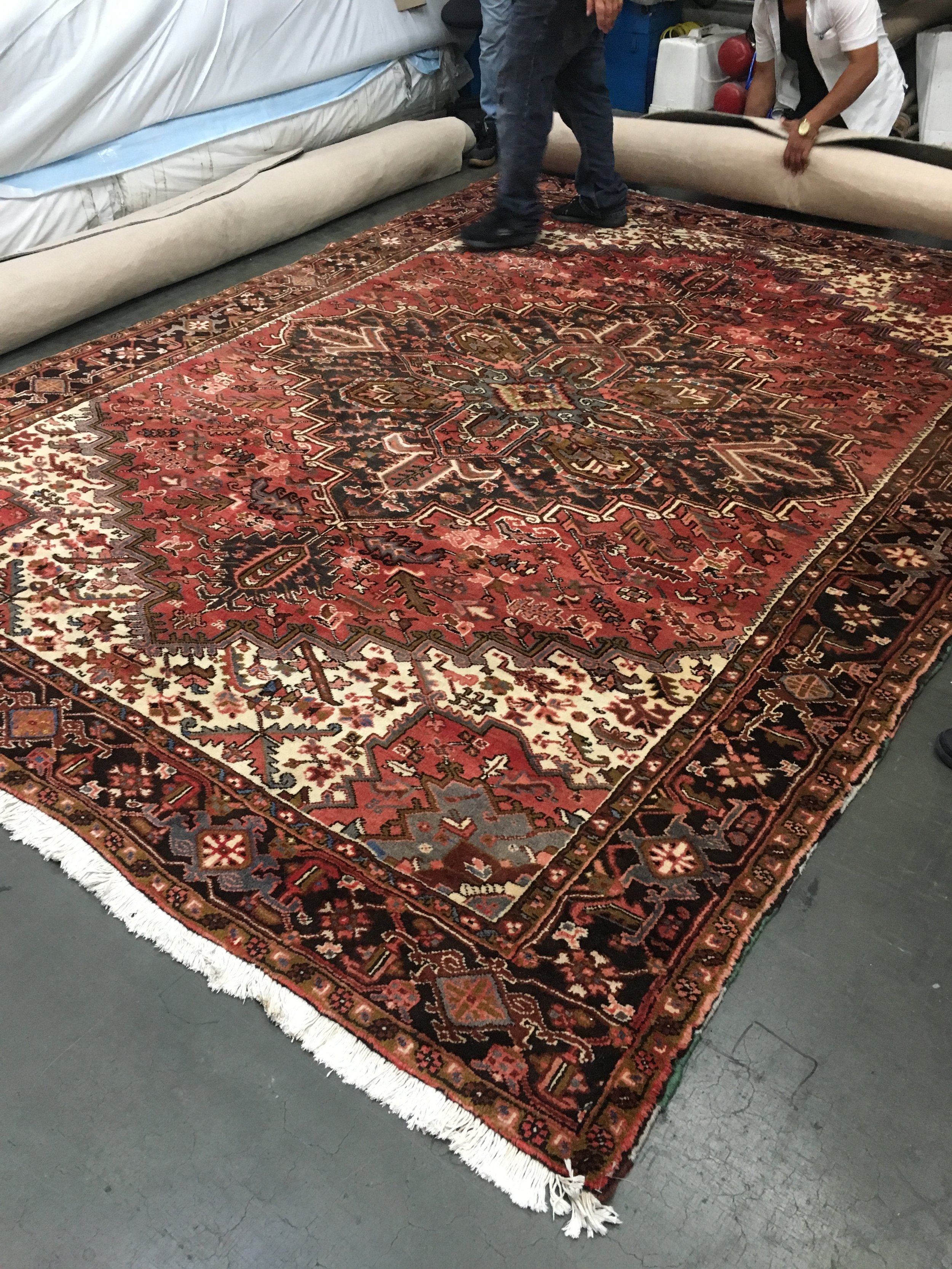
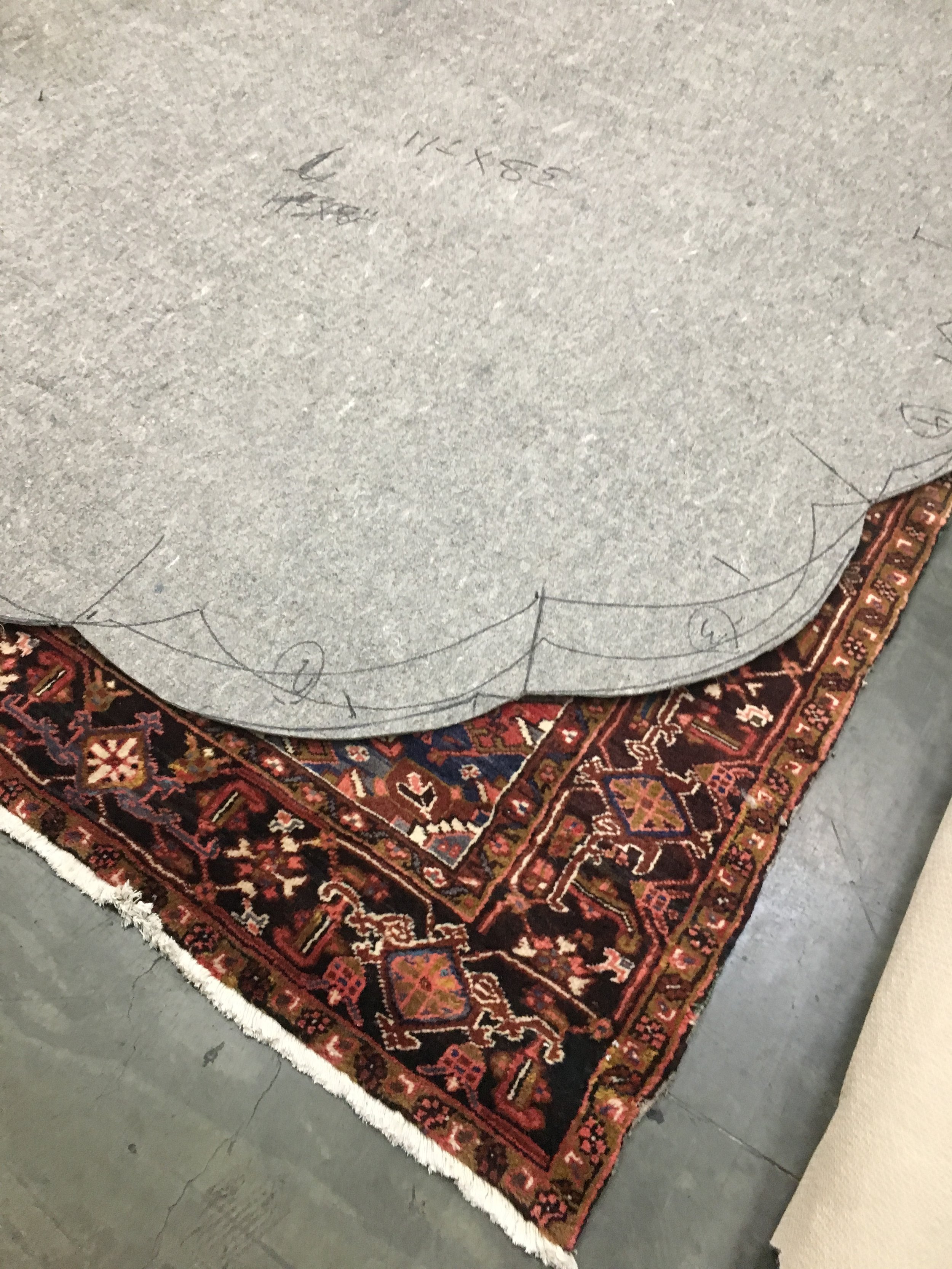
“The Mint has a moody bar feel. When we were thinking about rugs we knew we wanted to do something vintage. Their former office had a lot of layered vintage rugs and that space had a higher end, garage band kind of feel. Some of those elements were repeated here, with slight variations. For this new space, we didn’t want to layer the rugs in the same way as the previous office.”
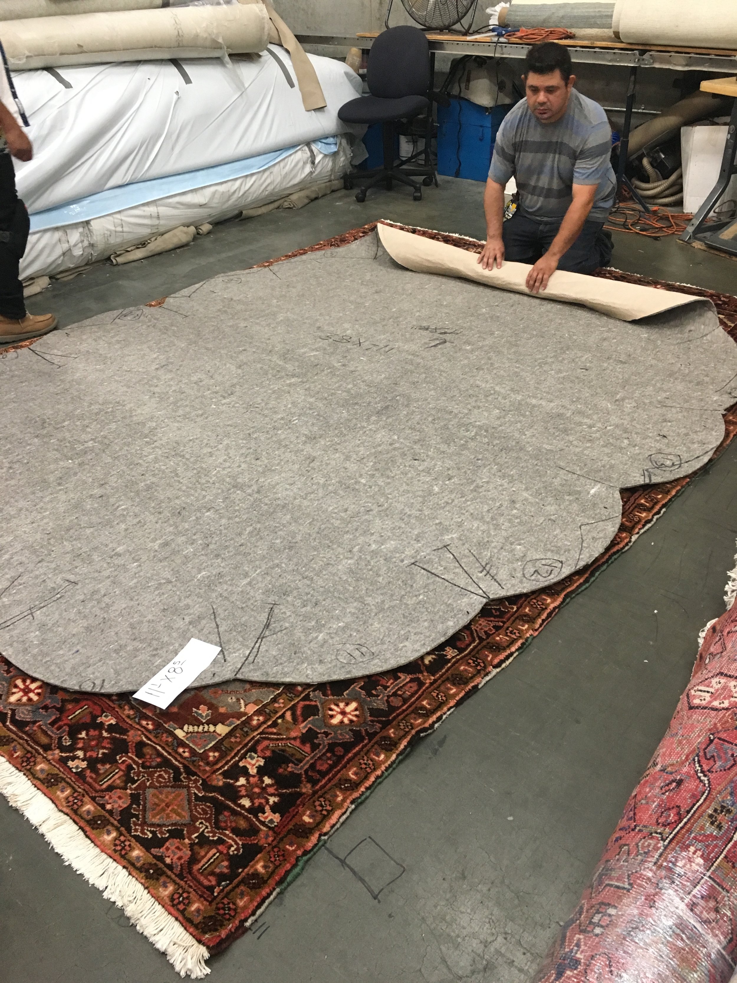
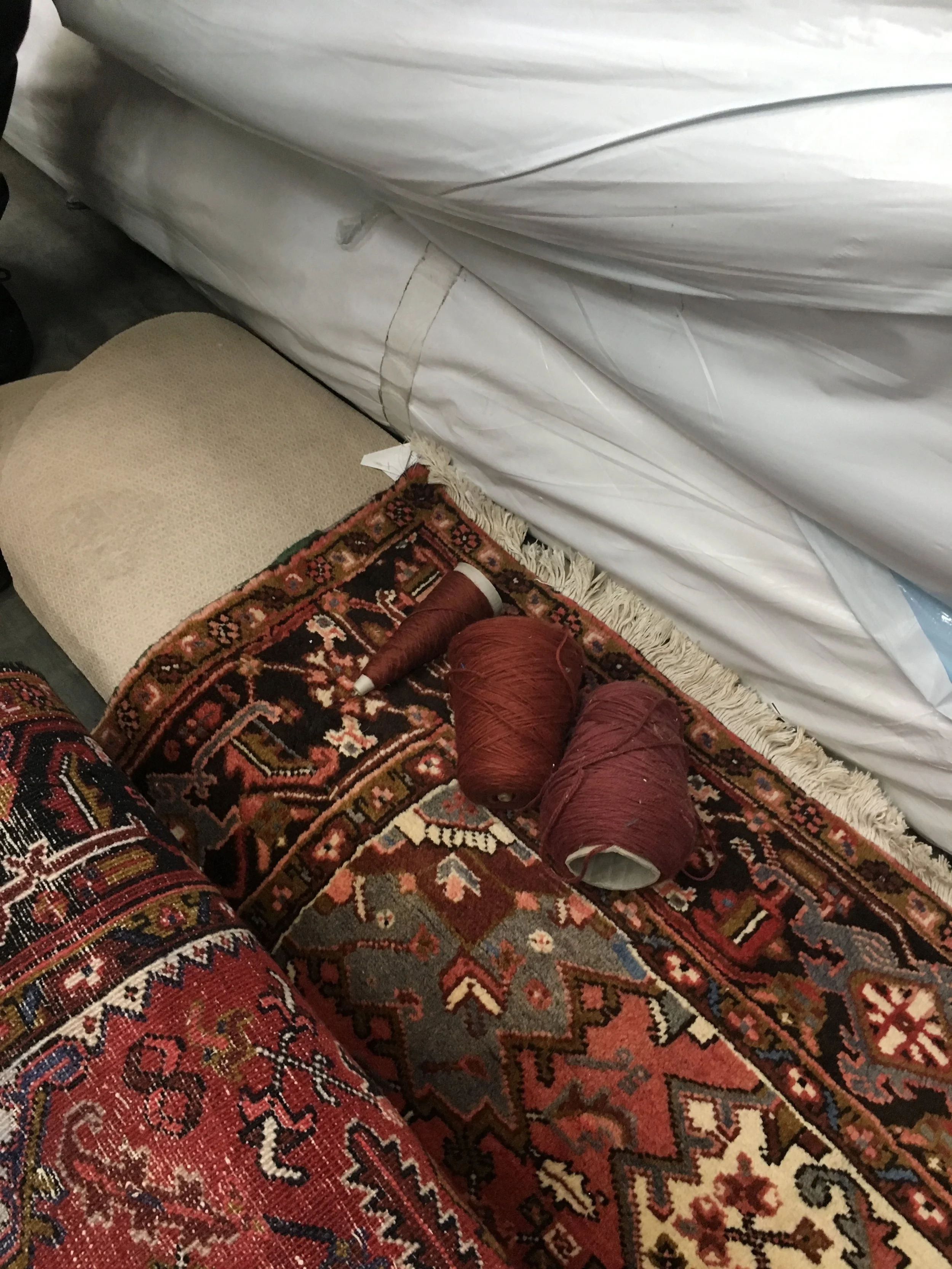
“We started arranging the furniture within your typical rectangular shape rug, but because you don’t see a lot of hard angles in this office the architect felt like they weren’t a good fit. So, we sourced these rugs from a great vintage shop in Southern California and decided to apply the same scallop shape to them, which was done by a fabricator in Marin, CA.
This was definitely a tricky task because each was a slightly different size, and since we were working with existing vintage rugs, we wanted to make sure that we maximized the size and didn't lose too much of the pattern. We had to be really strategic about how to template the shape. They took many, many iterations. I personally cut out the paper templates and worked with our rug fabricator to make sure that it was placed correctly, that we were optimizing the pattern with the size of the existing rug.”


